Graphics
We are going to start by exploring graphics with R using the midwest data. To access this data, run the following commands:
install.packages("tidyverse")library(tidyverse)Suppose we were interested in exploring the question: How does population density influence the percentage of the population with at least a college degree? Let’s explore these data closer.
midwest## # A tibble: 437 × 28
## PID county state area poptotal popdensity popwhite popblack popamerindian
## <int> <chr> <chr> <dbl> <int> <dbl> <int> <int> <int>
## 1 561 ADAMS IL 0.052 66090 1271. 63917 1702 98
## 2 562 ALEXAN… IL 0.014 10626 759 7054 3496 19
## 3 563 BOND IL 0.022 14991 681. 14477 429 35
## 4 564 BOONE IL 0.017 30806 1812. 29344 127 46
## 5 565 BROWN IL 0.018 5836 324. 5264 547 14
## 6 566 BUREAU IL 0.05 35688 714. 35157 50 65
## 7 567 CALHOUN IL 0.017 5322 313. 5298 1 8
## 8 568 CARROLL IL 0.027 16805 622. 16519 111 30
## 9 569 CASS IL 0.024 13437 560. 13384 16 8
## 10 570 CHAMPA… IL 0.058 173025 2983. 146506 16559 331
## # … with 427 more rows, and 19 more variables: popasian <int>, popother <int>,
## # percwhite <dbl>, percblack <dbl>, percamerindan <dbl>, percasian <dbl>,
## # percother <dbl>, popadults <int>, perchsd <dbl>, percollege <dbl>,
## # percprof <dbl>, poppovertyknown <int>, percpovertyknown <dbl>,
## # percbelowpoverty <dbl>, percchildbelowpovert <dbl>, percadultpoverty <dbl>,
## # percelderlypoverty <dbl>, inmetro <int>, category <chr>This will bring up the first 10 rows of the data (hiding the additional 8,592) rows. A first common step to explore our research question is to plot the data. To do this we are going to use the R package, ggplot2, which was installed when running the install.packages command above. You can explore the midwest data by calling up the help file as well with ?midwest.
Create a ggplot
To plot these two variables from the midwest data, we will use the function ggplot and geom_point to add a layer of points. We will treat popdensity as the x variable and percollege as the y variable.
ggplot(data = midwest) +
  geom_point(mapping = aes(x = popdensity, y = percollege))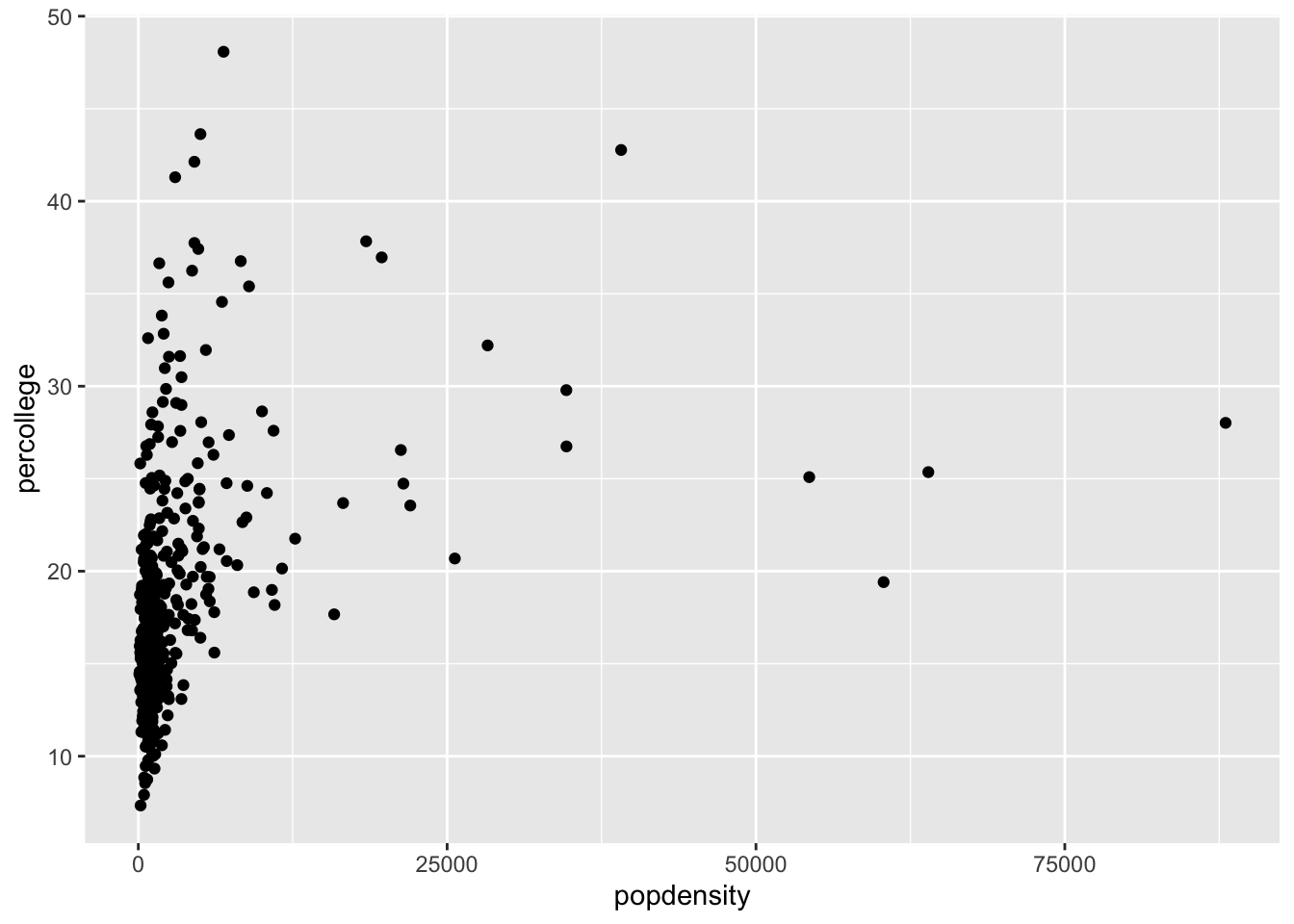
Examples
- Try plotting
popdensitybystate. - Try plotting
countybystate. Does this plot work? - Bonus: Try just using the
ggplot(data = midwest)from above. What do you get? Does this make sense?
Note: You should be able to modify the structure of the code above to do this.
Add Aesthetics
Aesthetics are a way to explore more complex interactions within the data. Particularly, from the above example, lets add in the state variable to the plot via an aesthetic.
ggplot(data = midwest) +
  geom_point(mapping = aes(x = popdensity, y = percollege, color = state))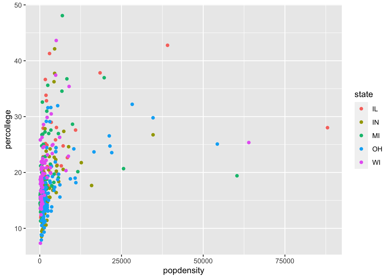
As you can see, we simply colored the points by the state they belong in. Does there appear to be a trend?
Examples
- Using the same aesthetic structure as above, instead of using colors, make the shape of the points different for each state.
- Instead of color, use
alphainstead. What does this do to the plot?
Global Aesthetics
Above, we specified a variable to an aesthetic, which is a common use of aesthetics. However, the aesthetics can also be assigned globally. Here are two examples using the first scatterplot created.
ggplot(data = midwest) +
  geom_point(mapping = aes(x = popdensity, y = percollege), color = 'pink')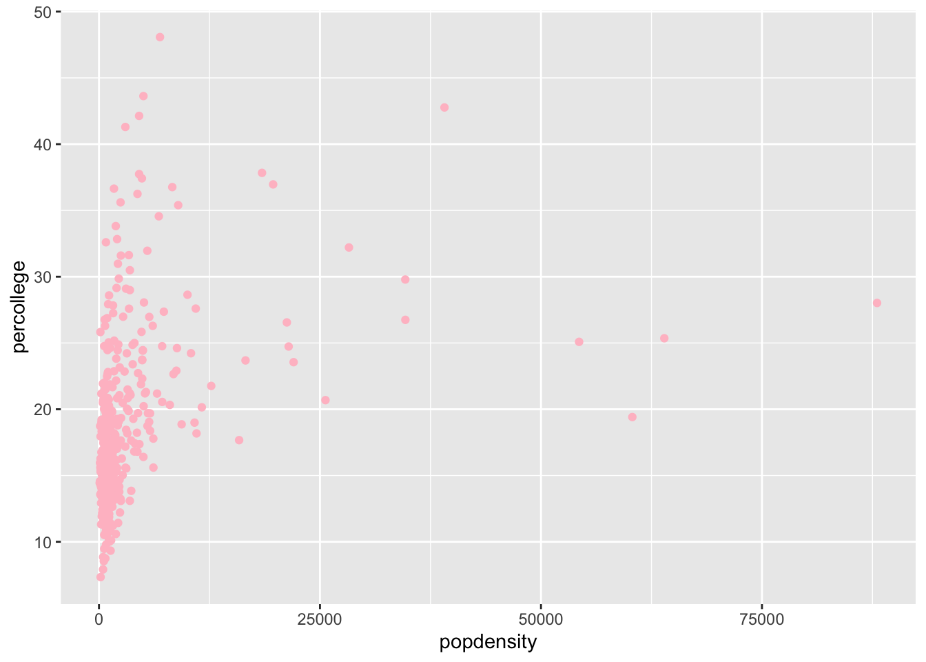
ggplot(data = midwest) +
  geom_point(mapping = aes(x = popdensity, y = percollege), shape = 15)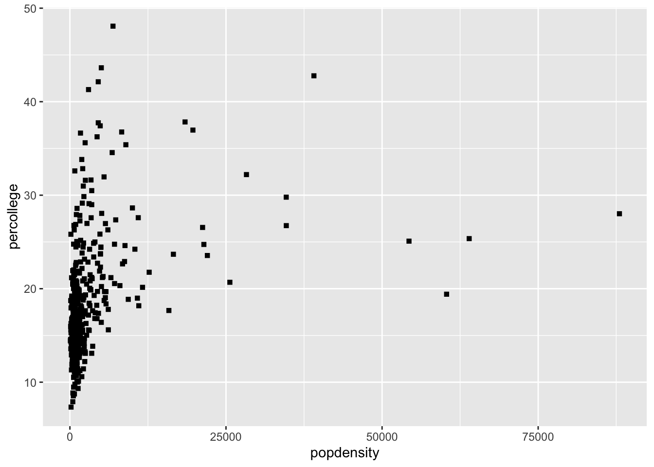
These two plots changed the aesthetics for all of the points. Notice, the suttle difference between the code for these plots and that for the plot above. The placement of the aesthetic is crucial, if it is within the parentheses for aes() then it should be assigned a variable. If it is outside, as in the last two examples, it will define the aesthetic for all the data.
Examples
- Try the following command:
colors(). This will print a vector of all the color names within R, try a few to find your favorites. - What happens if you use the following code:
ggplot(data = midwest) +
  geom_point(mapping = aes(x = popdensity, y = percollege, color = 'green'))
What is the problem?
Facets
Instead of defining an aesthetic to change the color or shape of points by a third variable, we can also plot each groups data in a single plot and combine them. The process is easy with ggplot2 by using facets.
ggplot(data = midwest) +
  geom_point(mapping = aes(x = popdensity, y = percollege)) +
  facet_grid(. ~ state)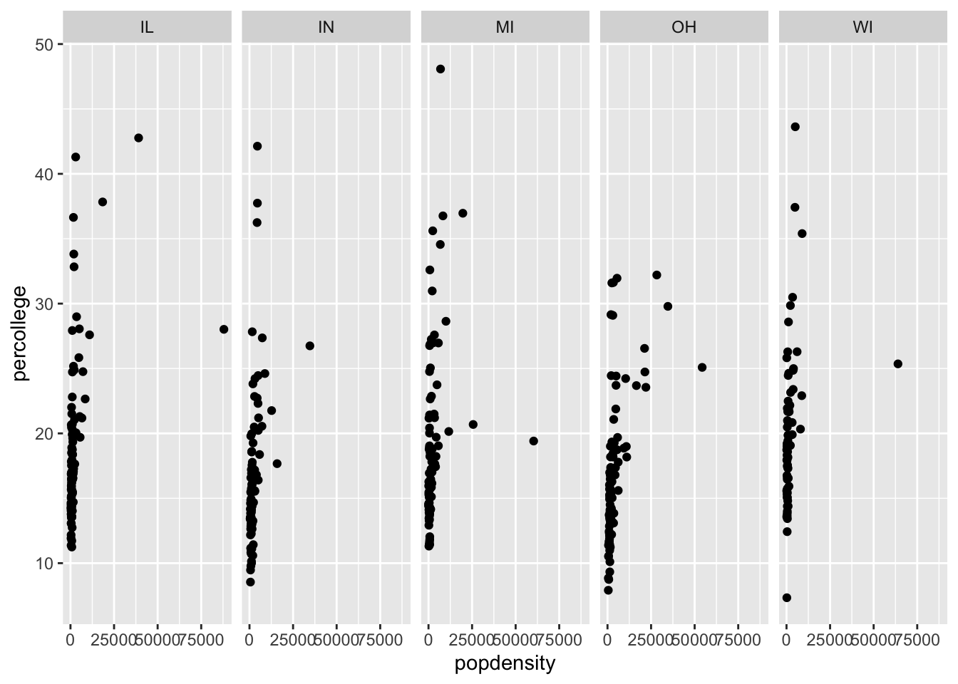
You can also use facet_wrap.
ggplot(data = midwest) +
  geom_point(mapping = aes(x = popdensity, y = percollege)) +
  facet_wrap(~ state)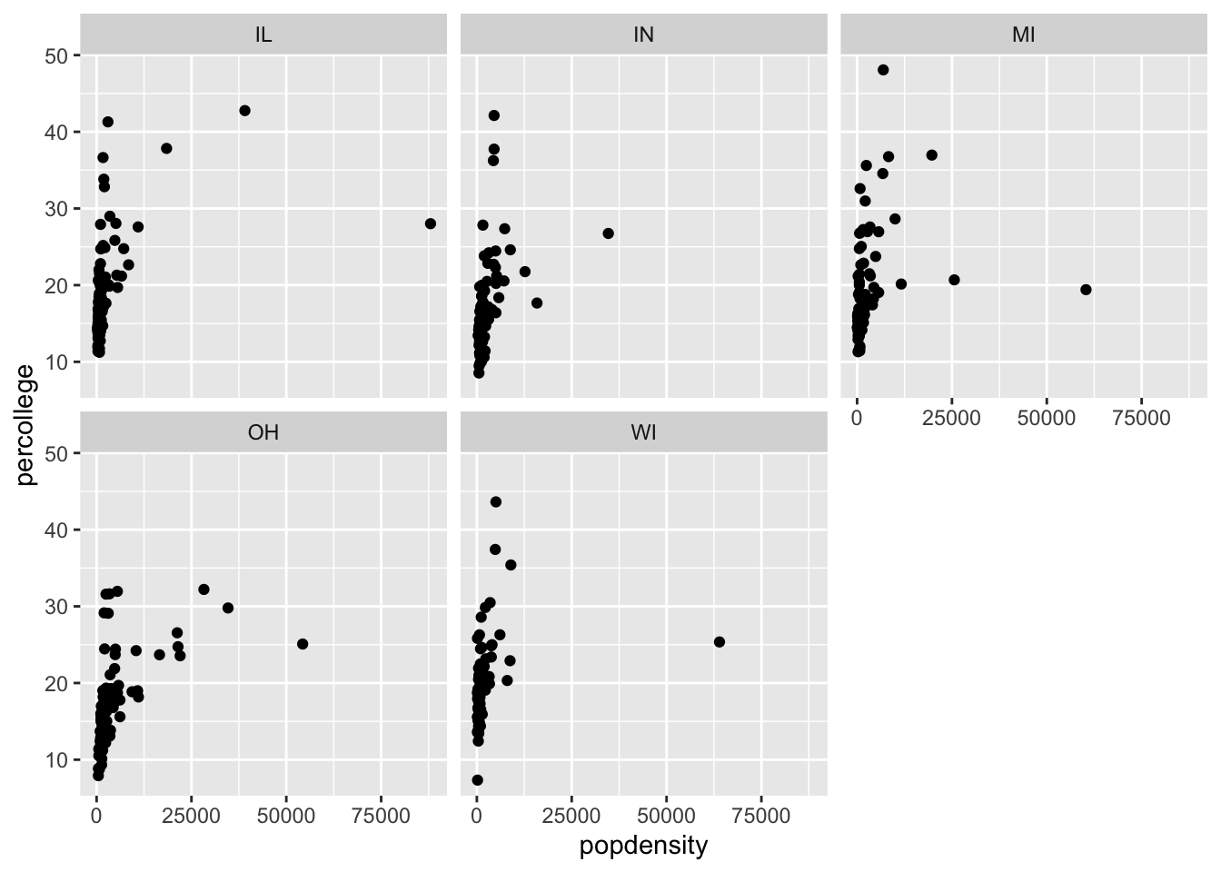
Examples
- Can you facet with a continuous variable? Try it!
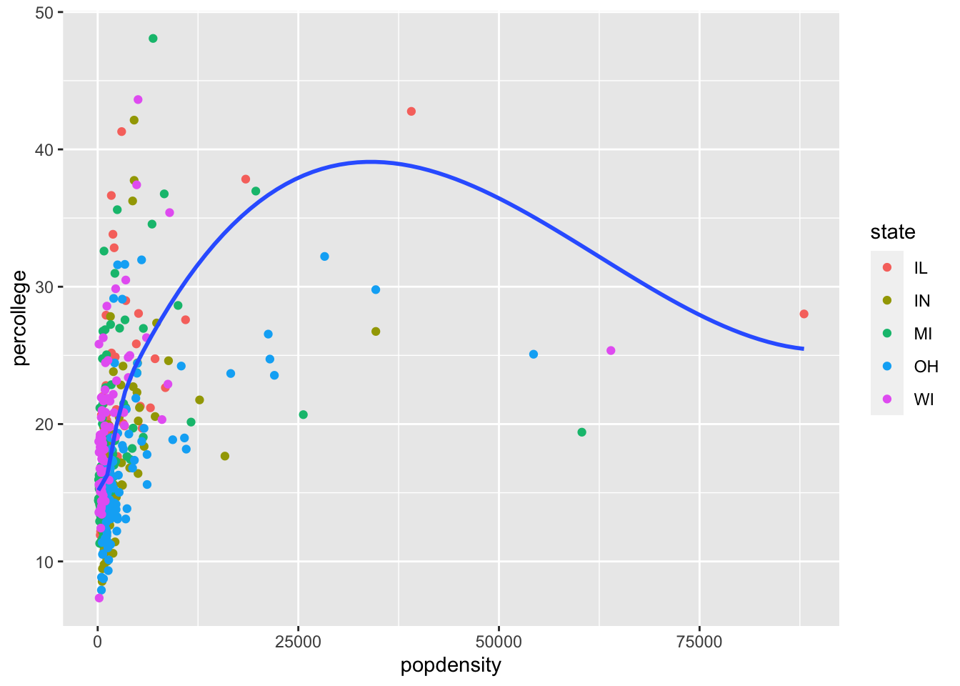
Geoms
ggplot2 uses a grammar of graphics which makes it easy to switch different plot types (called geoms) once you are comfortable with the basic syntax. For example, how does the following plot differ from the scatterplot first generated above? What is similar?
ggplot(data = midwest) +
  geom_smooth(mapping = aes(x = popdensity, y = percollege))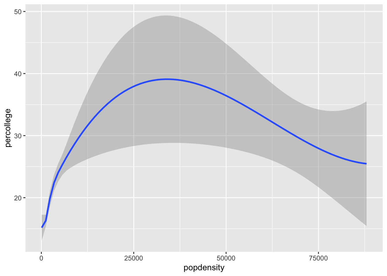
We can also do this plot by states
ggplot(data = midwest) +
  geom_smooth(mapping = aes(x = popdensity, y = percollege, linetype = state),
              se = FALSE)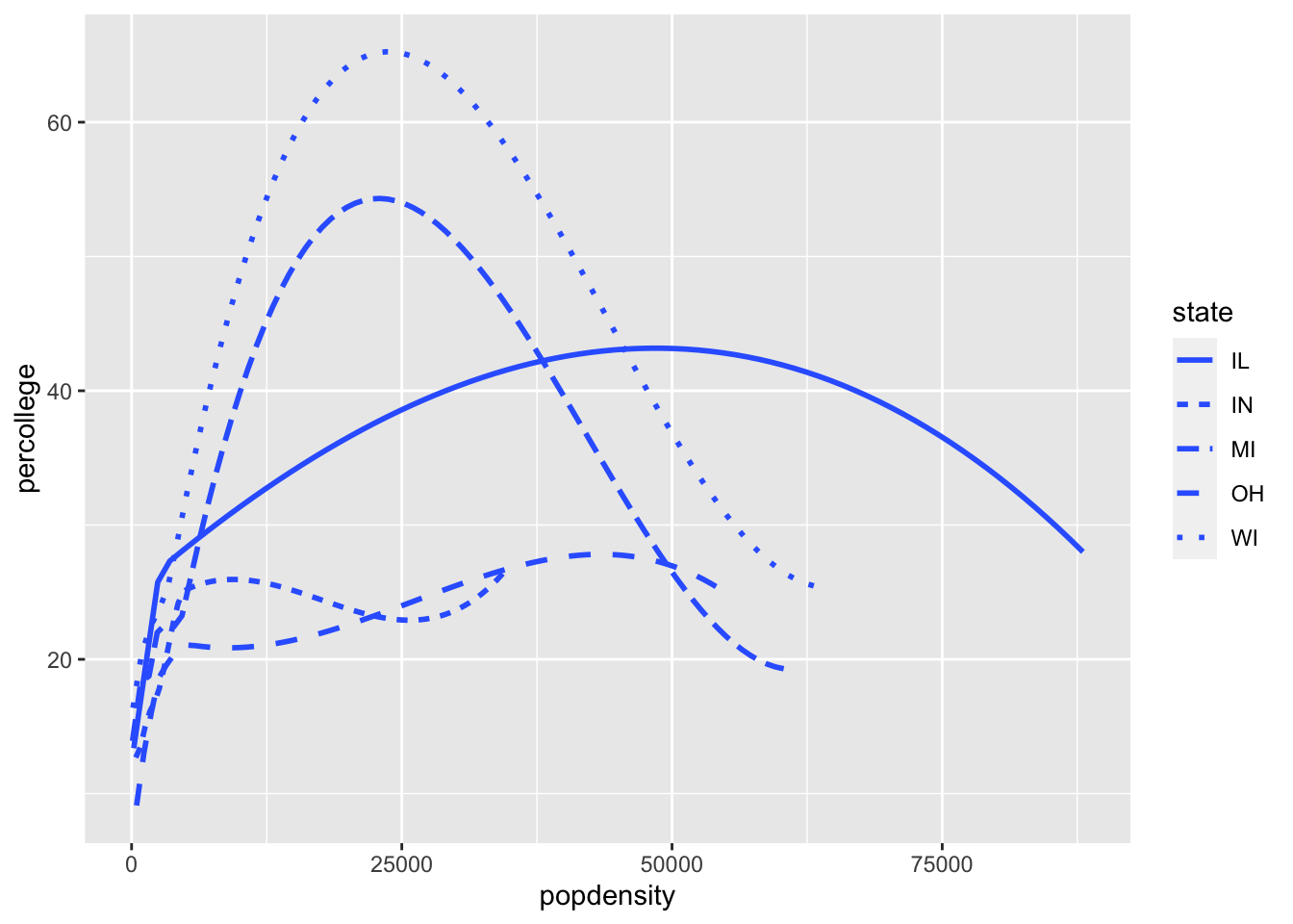
What about the code above gave me the different lines for each state? Note, I also removed the standard error shading from the plot as well.
Examples
- It is possible to combine geoms, which we will do next, but try it first. Try to recreate this plot.

Combining multiple geoms
Combining more than one geom into a single plot is relatively straightforward, but a few considerations are important. Essentially to do the task, we just simply need to combine the two geoms we have used:
ggplot(data = midwest) +
  geom_point(aes(x = popdensity, y = percollege, color = state)) +
  geom_smooth(mapping = aes(x = popdensity, y = percollege, color = state),
              se = FALSE)
A couple points about combining geoms, first, the order matters. In the above example, we called geom_point first, then geom_smooth. When plotting these data, the points will then be plotted first followed by the lines. Try flipping the order of the two geoms to see how the plot differs.
We can also simplify this code to not duplicate typing:
ggplot(data = midwest, mapping = aes(x = popdensity, y = percollege, color = state)) +
  geom_point() +
  geom_smooth(se = FALSE)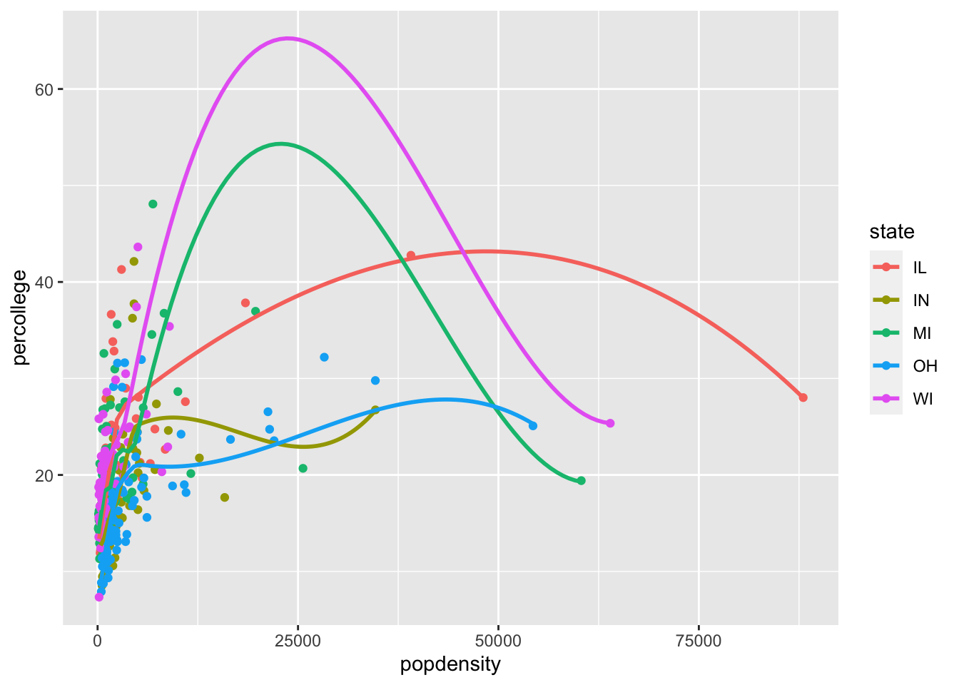
Examples
- Can you recreate the following figure?
Other geom examples
There are many other geoms available to use. To see them all, visit https://ggplot2.tidyverse.org/reference/index.html which gives examples of all the possibilities. This is a handy resource that I keep going back to.
Geoms for single variables
The introduction to plotting has been with two variables, but lets take a step back and focus on one variable with a bar chart.
ggplot(data = midwest, mapping = aes(x = state)) +
  geom_bar()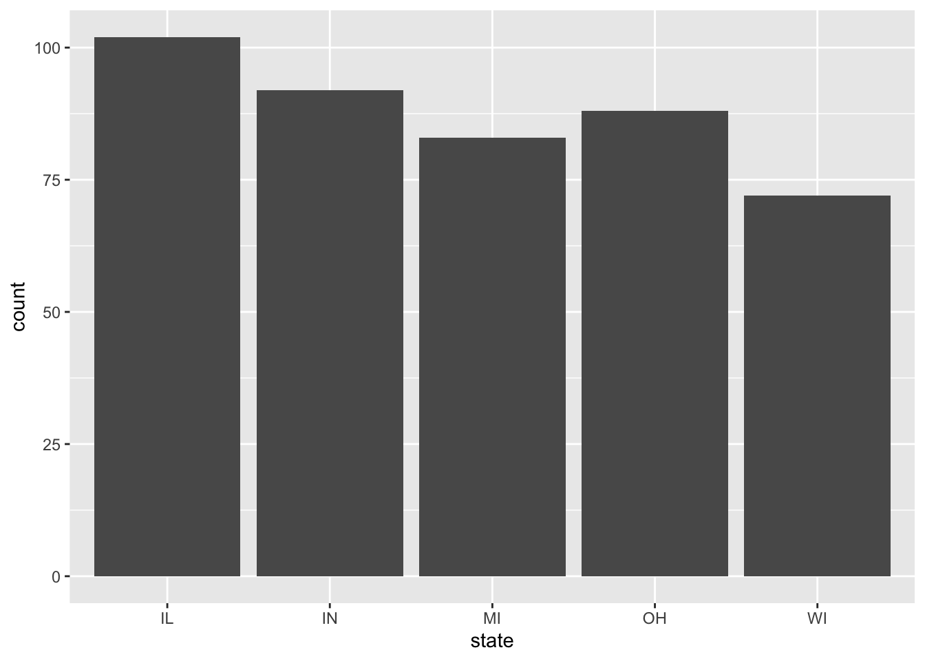
You can also easily add aesthetics this base plot as shown before.
ggplot(data = midwest, mapping = aes(x = state)) +
  geom_bar(aes(fill = factor(inmetro)))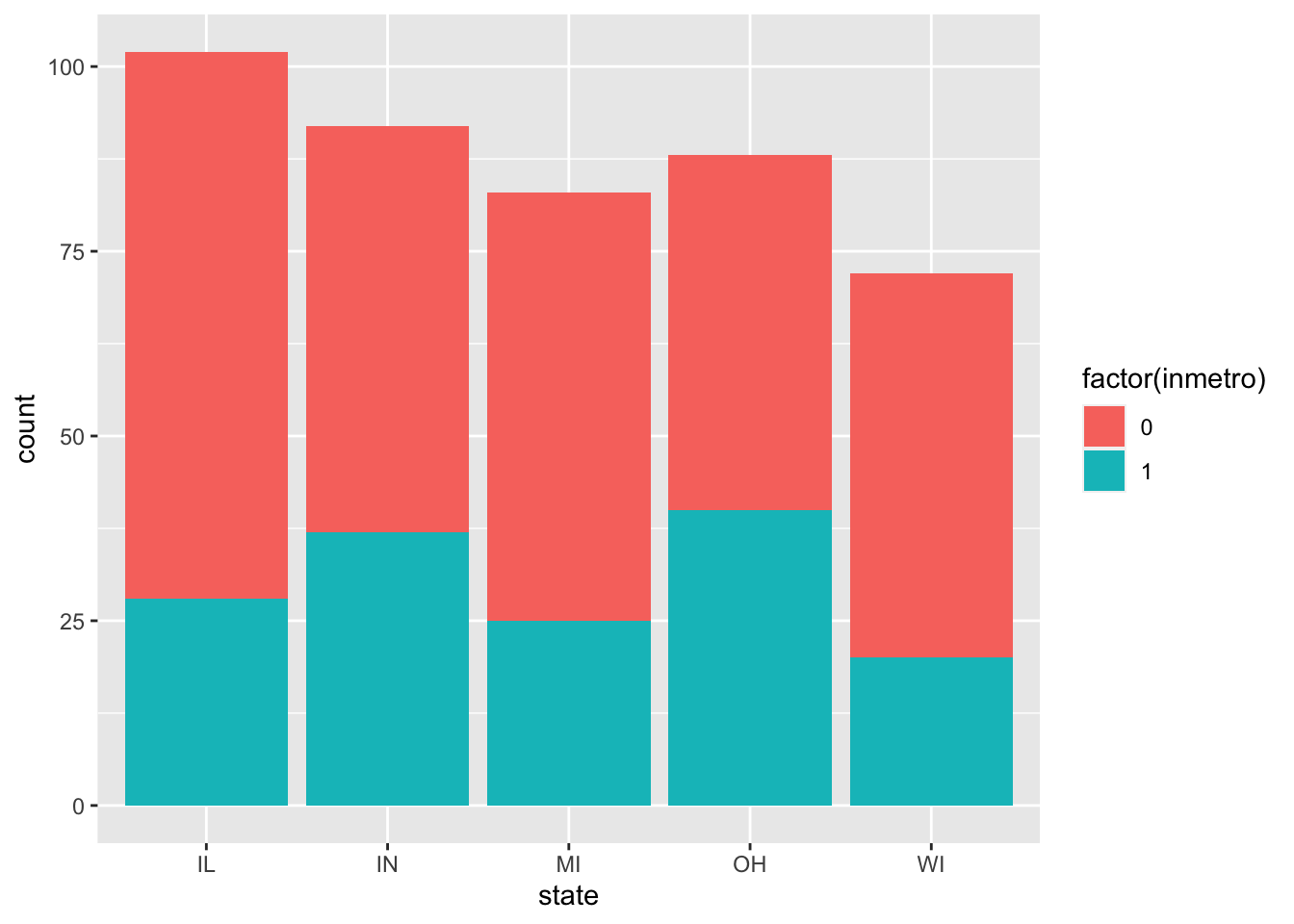
A few additions can help interpretation of this plot:
ggplot(data = midwest, mapping = aes(x = state)) +
  geom_bar(aes(fill = factor(inmetro)), position = 'fill')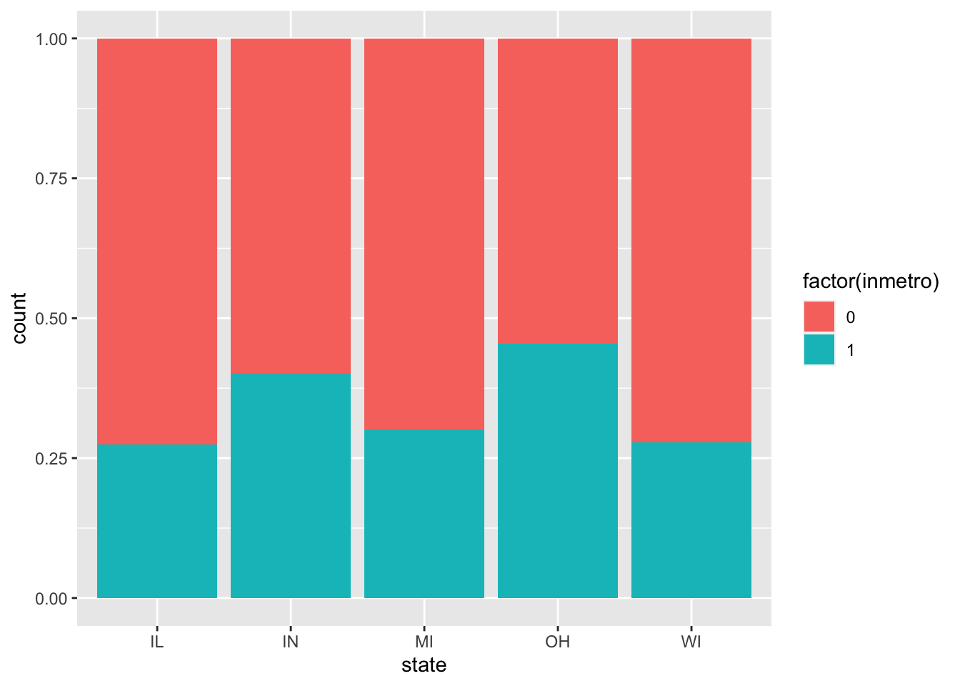
ggplot(data = midwest, mapping = aes(x = state)) +
  geom_bar(aes(fill = factor(inmetro)), position = 'dodge')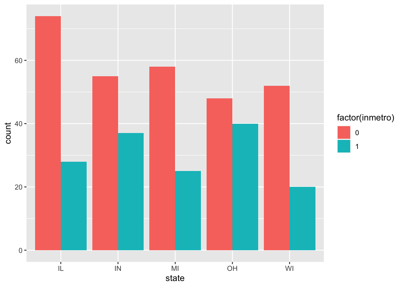
It is also possible to do a histrogram of a quantitative variable:
ggplot(data = midwest, mapping = aes(x = popdensity)) +
  geom_histogram()
## `stat_bin()` using `bins = 30`. Pick better value with `binwidth`.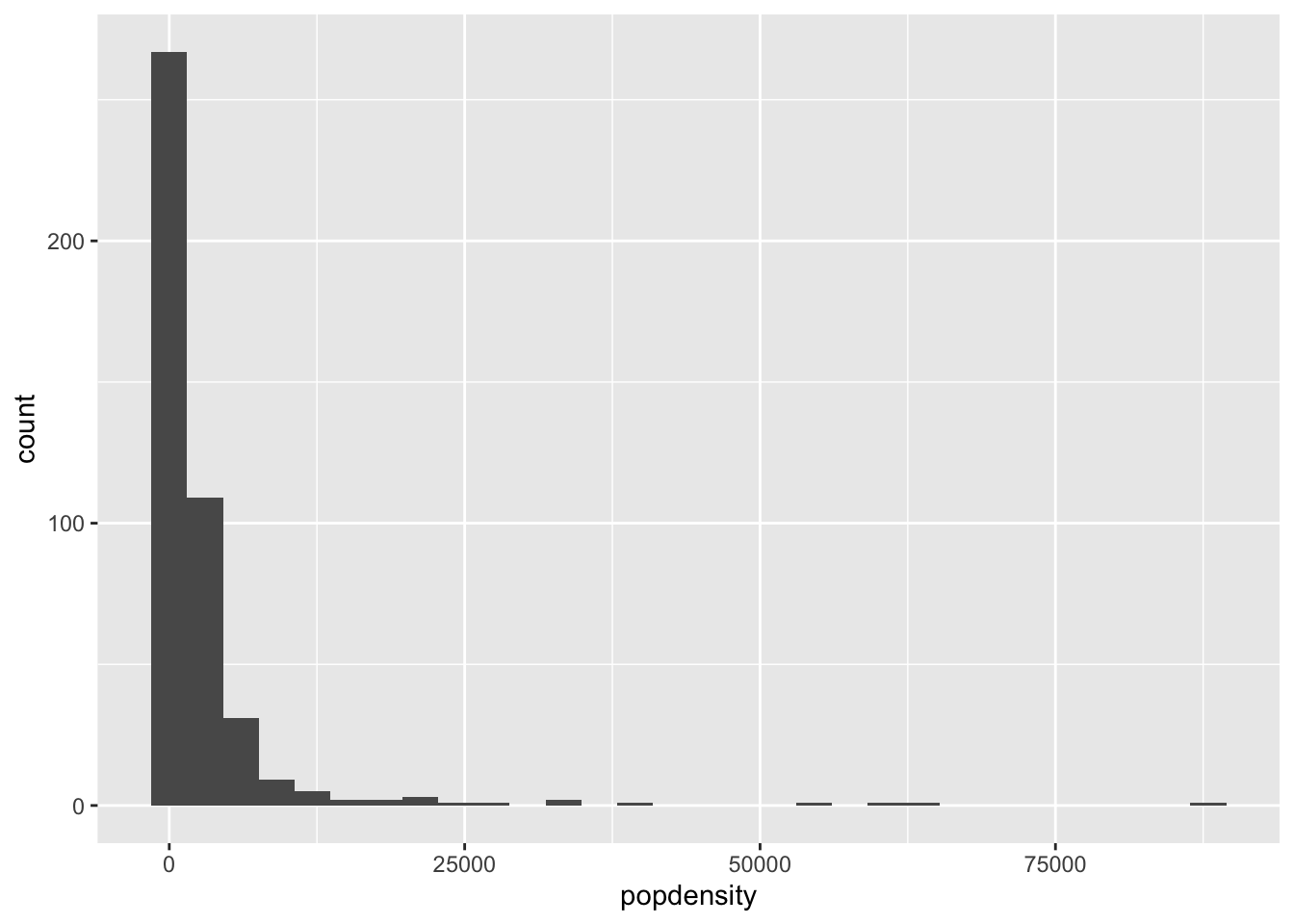
You can adjust the binwidth directly:
ggplot(data = midwest, mapping = aes(x = popdensity)) +
  geom_histogram(binwidth = 1000)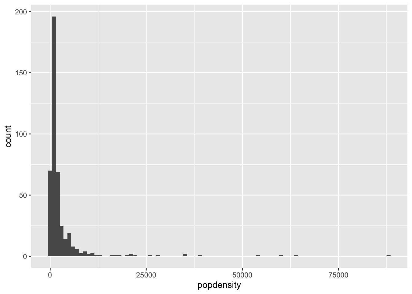
Examples
With more than two groups, histograms are difficult to interpret due to overlap. Instead, use the
geom_densityto create a density plot forpopdensityfor each state. The final plot should look similar to this: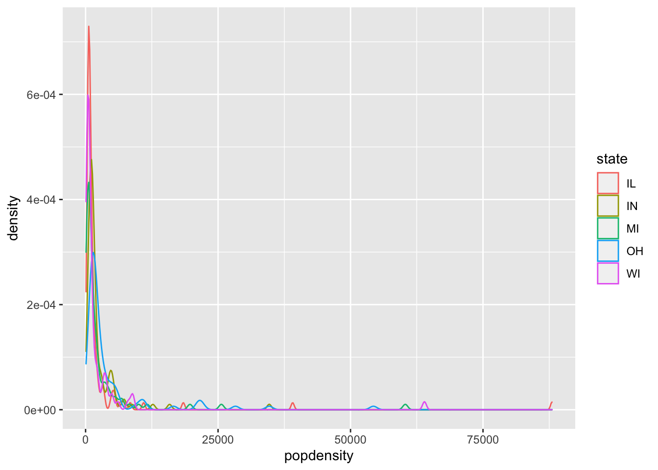
Using
geom_boxplot, create boxplots withpopdensityas the y variable andstateas the x variable. Bonus: facet this plot by the variableinmetro.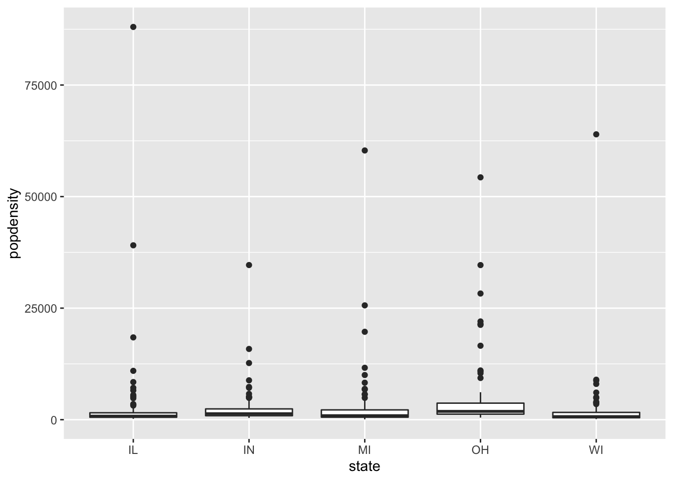
Plot Customization
There are many many ways to adjust the look of the plot, I will discuss a few that are common.
Change axes
Axes are something that are commonly altered, particularly to give them a good name and also to alter the values shown on the axes. These are generally done with scale_x_* and scale_y_* where * is a filler based on the type of variable on the axes.
For example:
ggplot(data = midwest, mapping = aes(x = popdensity, y = percollege, color = state)) +
  geom_point() +
  scale_x_continuous("Population Density") +
  scale_y_continuous("Percent College Graduates")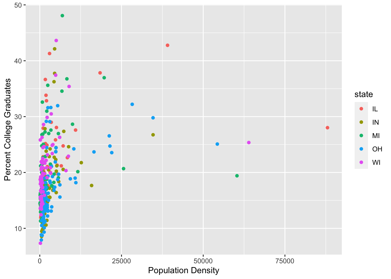
To change the legend title, the scale_color_discrete command can be used to adjust the color aesthetic and the variable is discrete.
ggplot(data = midwest, mapping = aes(x = popdensity, y = percollege, color = state)) +
  geom_point() +
  scale_x_continuous("Population Density") +
  scale_y_continuous("Percent College Graduates") +
  scale_color_discrete("State")
we can also alter the breaks showing on the x-axis.
ggplot(data = midwest, mapping = aes(x = popdensity, y = percollege, color = state)) +
  geom_point() +
  scale_x_continuous("Population Density", breaks = seq(0, 80000, 20000)) +
  scale_y_continuous("Percent College Graduates") +
  scale_color_discrete("State")
Zoom in on plot
You’ll notice that there are outliers in this scatterplot due to larger population density values for some counties. It may be of interest to zoom in on the plot. The plot can be zoomed in by using the coord_cartesian command as follows.
ggplot(data = midwest, mapping = aes(x = popdensity, y = percollege, color = state)) +
  geom_point() +
  scale_x_continuous("Population Density") +
  scale_y_continuous("Percent College Graduates") +
  scale_color_discrete("State") +
  coord_cartesian(xlim = c(0, 15000))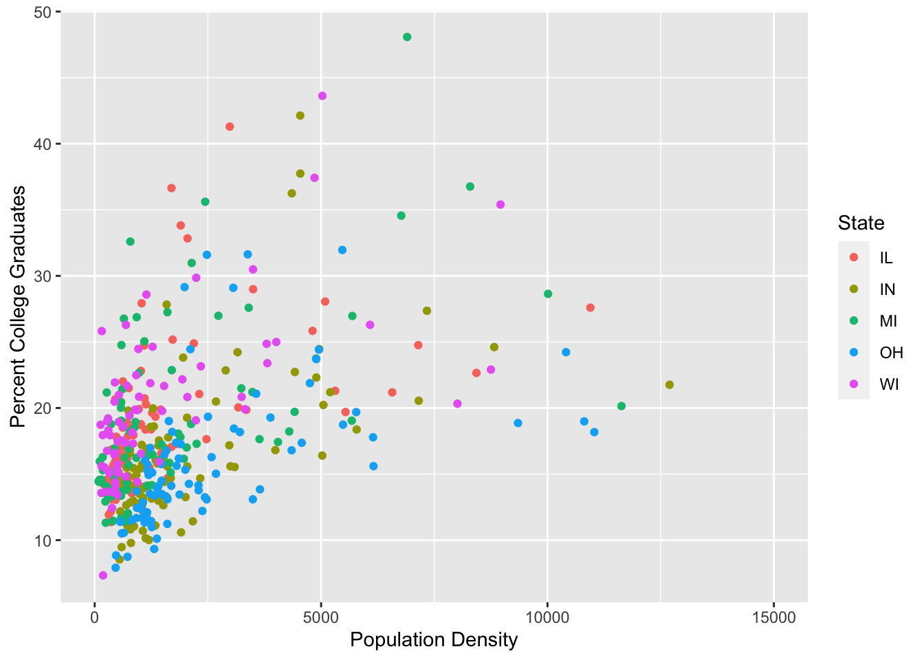
Note: This can also be achieved using the xlim argument to scale_x_continuous above, however this will cause some points to not be plotted. In this case it would not be a huge deal, however, if we plotted the smooth lines from before you can see the difference.
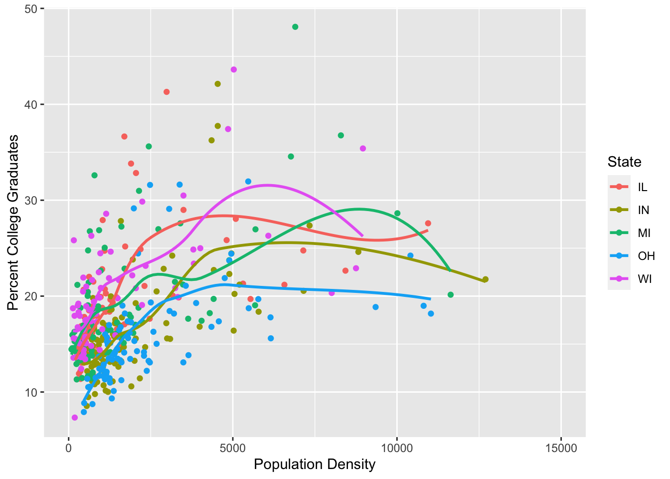
ggplot(data = midwest, mapping = aes(x = popdensity, y = percollege, color = state)) +
  geom_point() +
  geom_smooth(se = FALSE) +
  scale_x_continuous("Population Density") +
  scale_y_continuous("Percent College Graduates") +
  scale_color_discrete("State") +
  coord_cartesian(xlim = c(0, 15000))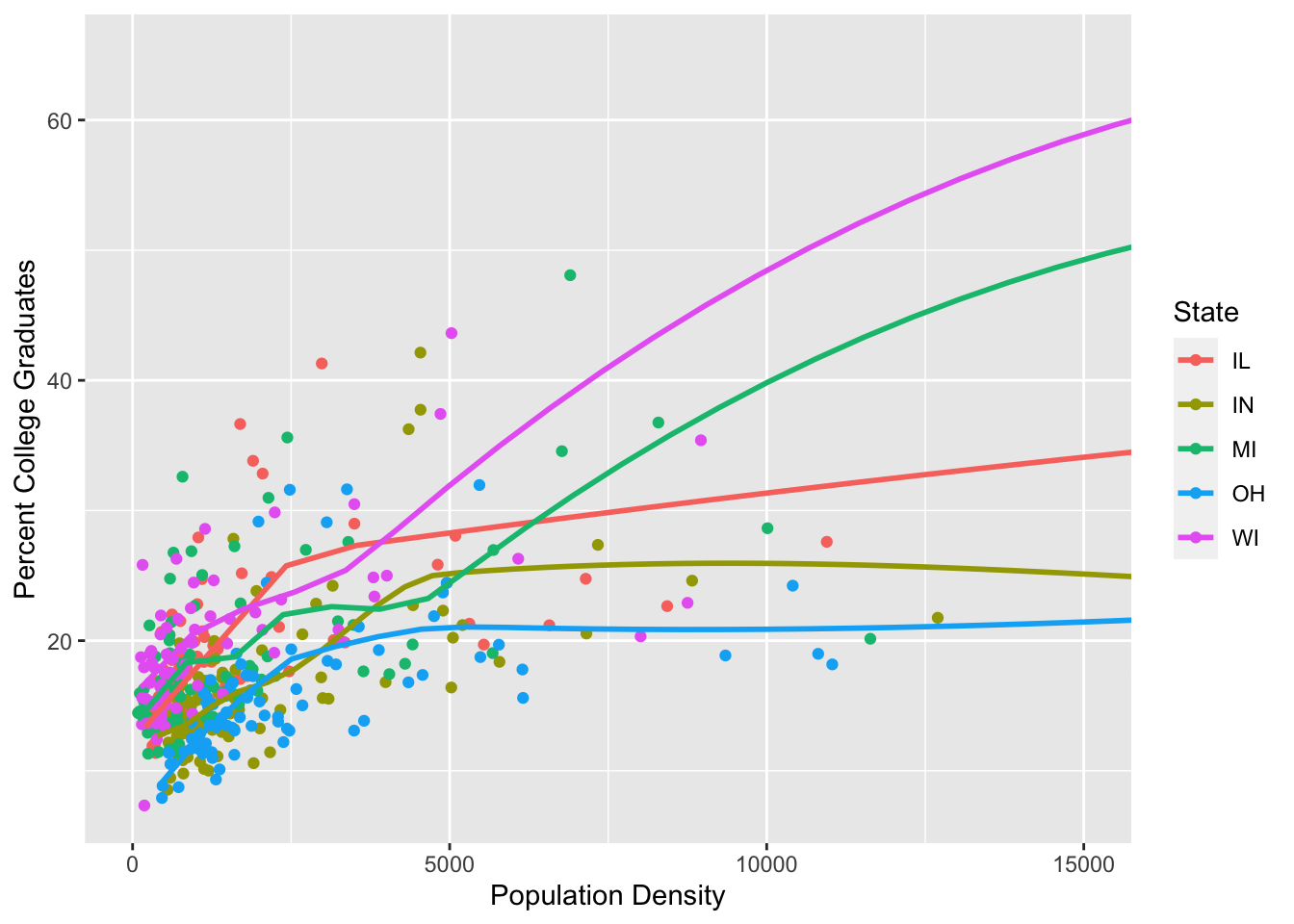
ggplot(data = midwest, mapping = aes(x = popdensity, y = percollege, color = state)) +
  geom_point() +
  geom_smooth(se = FALSE) +
  scale_x_continuous("Population Density", limits = c(0, 15000)) +
  scale_y_continuous("Percent College Graduates") +
  scale_color_discrete("State")
## Warning: Removed 16 rows containing non-finite values (stat_smooth).## Warning: Removed 16 rows containing missing values (geom_point).