Exploratory Data Analysis
Exploratory data analysis (EDA) is an important step in exploring and understanding your data. In addition, EDA does not suffer from problems with inferential statistics related to multiple (correlated) models on the same data. Instead, EDA is a great way to visualize, summarize, and prod your data without any consequences.
For this set of notes, we are going to use the following packages:
library(nycflights13)
library(tidyverse)
We will use a few different data sets, but the one we are going to start with is the flights data from the nycflights13 package. Below is the first 10 rows of the data.
flights## # A tibble: 336,776 × 19
## year month day dep_time sched_dep_time dep_delay arr_time sched_arr_time
## <int> <int> <int> <int> <int> <dbl> <int> <int>
## 1 2013 1 1 517 515 2 830 819
## 2 2013 1 1 533 529 4 850 830
## 3 2013 1 1 542 540 2 923 850
## 4 2013 1 1 544 545 -1 1004 1022
## 5 2013 1 1 554 600 -6 812 837
## 6 2013 1 1 554 558 -4 740 728
## 7 2013 1 1 555 600 -5 913 854
## 8 2013 1 1 557 600 -3 709 723
## 9 2013 1 1 557 600 -3 838 846
## 10 2013 1 1 558 600 -2 753 745
## # … with 336,766 more rows, and 11 more variables: arr_delay <dbl>,
## # carrier <chr>, flight <int>, tailnum <chr>, origin <chr>, dest <chr>,
## # air_time <dbl>, distance <dbl>, hour <dbl>, minute <dbl>, time_hour <dttm>This data contains information on all flights that departed from the three airports in NYC in 2013. As you can see, the data has a total of 336776 rows and 19. For additional information use ?flights.
Exploratory Data Analysis
The general process for proceeding with exploratory data analysis as summarized in the R for Data Science text are:
- Ask questions about your data
- Search for answers
- Refine or ask new questions about the data.
There are no bad questions when performing EDA, but some common questions worth exploring are:
- Missing Data
- Variation
- Covariation
- Rare cases
- Common cases
- Distributions
Missing Data
A first step in exploring the data is to explore if there are any missing data present in the data (likely). This is not an easy step, but determining the amount of missing data and, if possible, why these values are missing are important first steps. One quick way to get a view of this information for the entire data is to use the summary command. An example is given with the flights data below.
summary(flights)## year month day dep_time sched_dep_time
## Min. :2013 Min. : 1.000 Min. : 1.00 Min. : 1 Min. : 106
## 1st Qu.:2013 1st Qu.: 4.000 1st Qu.: 8.00 1st Qu.: 907 1st Qu.: 906
## Median :2013 Median : 7.000 Median :16.00 Median :1401 Median :1359
## Mean :2013 Mean : 6.549 Mean :15.71 Mean :1349 Mean :1344
## 3rd Qu.:2013 3rd Qu.:10.000 3rd Qu.:23.00 3rd Qu.:1744 3rd Qu.:1729
## Max. :2013 Max. :12.000 Max. :31.00 Max. :2400 Max. :2359
## NA's :8255
## dep_delay arr_time sched_arr_time arr_delay
## Min. : -43.00 Min. : 1 Min. : 1 Min. : -86.000
## 1st Qu.: -5.00 1st Qu.:1104 1st Qu.:1124 1st Qu.: -17.000
## Median : -2.00 Median :1535 Median :1556 Median : -5.000
## Mean : 12.64 Mean :1502 Mean :1536 Mean : 6.895
## 3rd Qu.: 11.00 3rd Qu.:1940 3rd Qu.:1945 3rd Qu.: 14.000
## Max. :1301.00 Max. :2400 Max. :2359 Max. :1272.000
## NA's :8255 NA's :8713 NA's :9430
## carrier flight tailnum origin
## Length:336776 Min. : 1 Length:336776 Length:336776
## Class :character 1st Qu.: 553 Class :character Class :character
## Mode :character Median :1496 Mode :character Mode :character
## Mean :1972
## 3rd Qu.:3465
## Max. :8500
##
## dest air_time distance hour
## Length:336776 Min. : 20.0 Min. : 17 Min. : 1.00
## Class :character 1st Qu.: 82.0 1st Qu.: 502 1st Qu.: 9.00
## Mode :character Median :129.0 Median : 872 Median :13.00
## Mean :150.7 Mean :1040 Mean :13.18
## 3rd Qu.:192.0 3rd Qu.:1389 3rd Qu.:17.00
## Max. :695.0 Max. :4983 Max. :23.00
## NA's :9430
## minute time_hour
## Min. : 0.00 Min. :2013-01-01 05:00:00
## 1st Qu.: 8.00 1st Qu.:2013-04-04 13:00:00
## Median :29.00 Median :2013-07-03 10:00:00
## Mean :26.23 Mean :2013-07-03 05:22:54
## 3rd Qu.:44.00 3rd Qu.:2013-10-01 07:00:00
## Max. :59.00 Max. :2013-12-31 23:00:00
## This summary can be a bit difficult to digest at first, but can give some useful insight into the variables, including the amount of missing data for each variable.
You can dive into looking at specific rows that are missing with the filter command and the is.na function. An example pulling out rows with a missing dep_time values is illustrated:
filter(flights, is.na(dep_time))## # A tibble: 8,255 × 19
## year month day dep_time sched_dep_time dep_delay arr_time sched_arr_time
## <int> <int> <int> <int> <int> <dbl> <int> <int>
## 1 2013 1 1 NA 1630 NA NA 1815
## 2 2013 1 1 NA 1935 NA NA 2240
## 3 2013 1 1 NA 1500 NA NA 1825
## 4 2013 1 1 NA 600 NA NA 901
## 5 2013 1 2 NA 1540 NA NA 1747
## 6 2013 1 2 NA 1620 NA NA 1746
## 7 2013 1 2 NA 1355 NA NA 1459
## 8 2013 1 2 NA 1420 NA NA 1644
## 9 2013 1 2 NA 1321 NA NA 1536
## 10 2013 1 2 NA 1545 NA NA 1910
## # … with 8,245 more rows, and 11 more variables: arr_delay <dbl>,
## # carrier <chr>, flight <int>, tailnum <chr>, origin <chr>, dest <chr>,
## # air_time <dbl>, distance <dbl>, hour <dbl>, minute <dbl>, time_hour <dttm>We can also build more complex operations to look at data that is missing for one variable, but not another. For instance, if you look at the summary information above, you may notice there are more missing values for the arr_delay variable compared to the arr_time variable. To look at these values you can use the following command:
filter(flights, is.na(arr_delay) & !is.na(arr_time))## # A tibble: 717 × 19
## year month day dep_time sched_dep_time dep_delay arr_time sched_arr_time
## <int> <int> <int> <int> <int> <dbl> <int> <int>
## 1 2013 1 1 1525 1530 -5 1934 1805
## 2 2013 1 1 1528 1459 29 2002 1647
## 3 2013 1 1 1740 1745 -5 2158 2020
## 4 2013 1 1 1807 1738 29 2251 2103
## 5 2013 1 1 1939 1840 59 29 2151
## 6 2013 1 1 1952 1930 22 2358 2207
## 7 2013 1 2 905 822 43 1313 1045
## 8 2013 1 2 1125 925 120 1445 1146
## 9 2013 1 2 1848 1840 8 2333 2151
## 10 2013 1 2 1849 1724 85 2235 1938
## # … with 707 more rows, and 11 more variables: arr_delay <dbl>, carrier <chr>,
## # flight <int>, tailnum <chr>, origin <chr>, dest <chr>, air_time <dbl>,
## # distance <dbl>, hour <dbl>, minute <dbl>, time_hour <dttm>This may actually be a data error, as there is an arr_time value, a scheduled_arr_time value, but no arr_delay value. This could then be calculated manually to reduce the number of missing values with this variable.
Viewing missing data graphically
It may be useful to view missing data graphically. This may be useful to see if there are specific trends in the data in relation to the missing values. A few ways to plot these data may be useful.
First, it is always a good rule to explore missing data in relation to other variables in the data. If there is evidence that another variable is influencing whether a value is missing, additional statistical controls are needed to adjust for these concerns.
For example, we could explore if the scheduled arrival time is related to whether the actual arrival flight time is missing.
flights %>%
  mutate(
    miss_arrival = is.na(arr_time)
  ) %>%
  ggplot(mapping = aes(sched_arr_time)) +
  geom_freqpoly(aes(color = miss_arrival)) +
  theme_bw()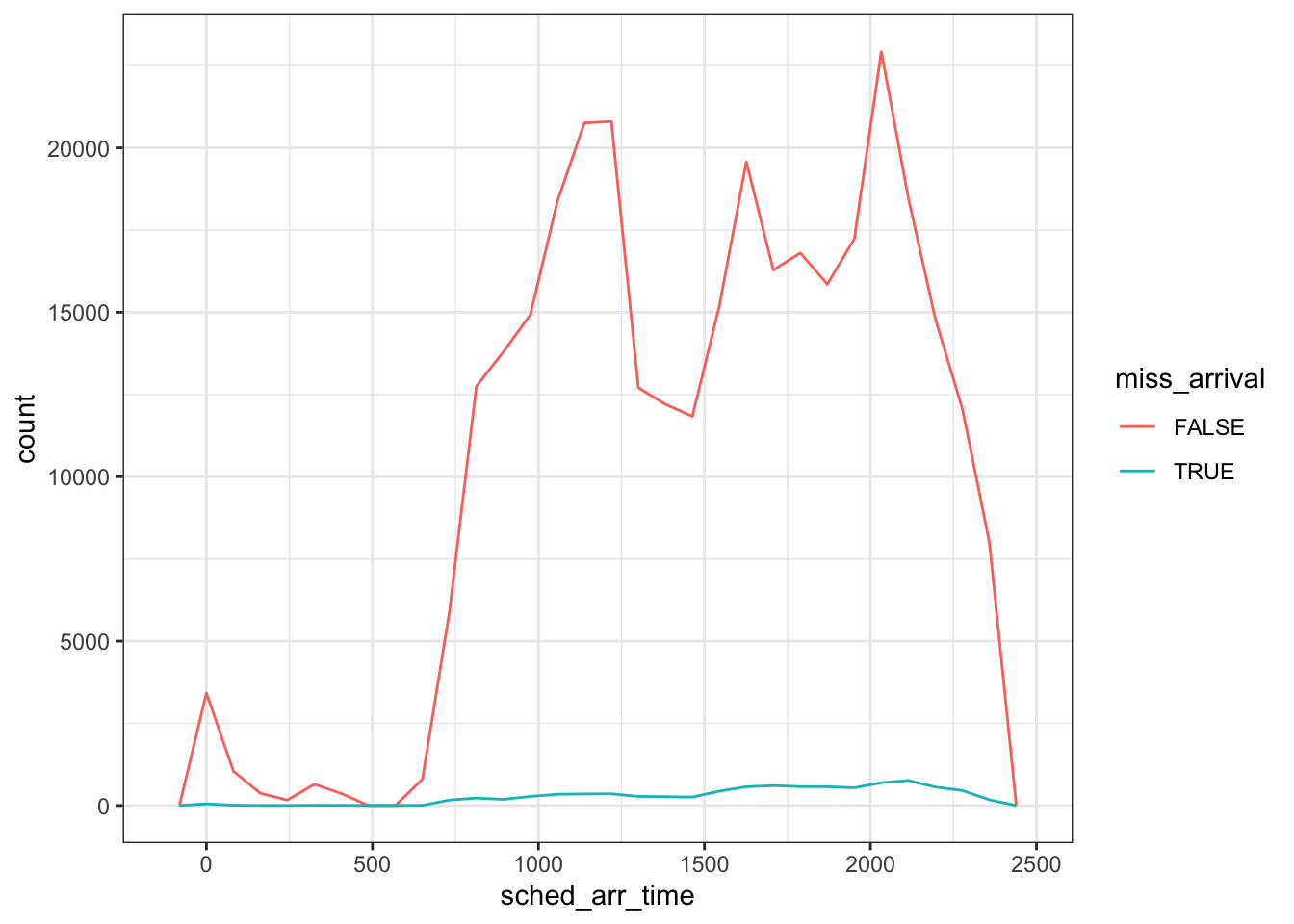
Notice that the count metric masks much of what is being visualized here as there are many more flights that arrived compared to those with missing times. To adjust this, we simply need to change the y-axis from counts to density.
flights %>%
  mutate(
    miss_arrival = is.na(arr_time)
  ) %>%
  ggplot(mapping = aes(x = sched_arr_time, y = ..density..)) +
  geom_freqpoly(aes(color = miss_arrival)) +
  theme_bw()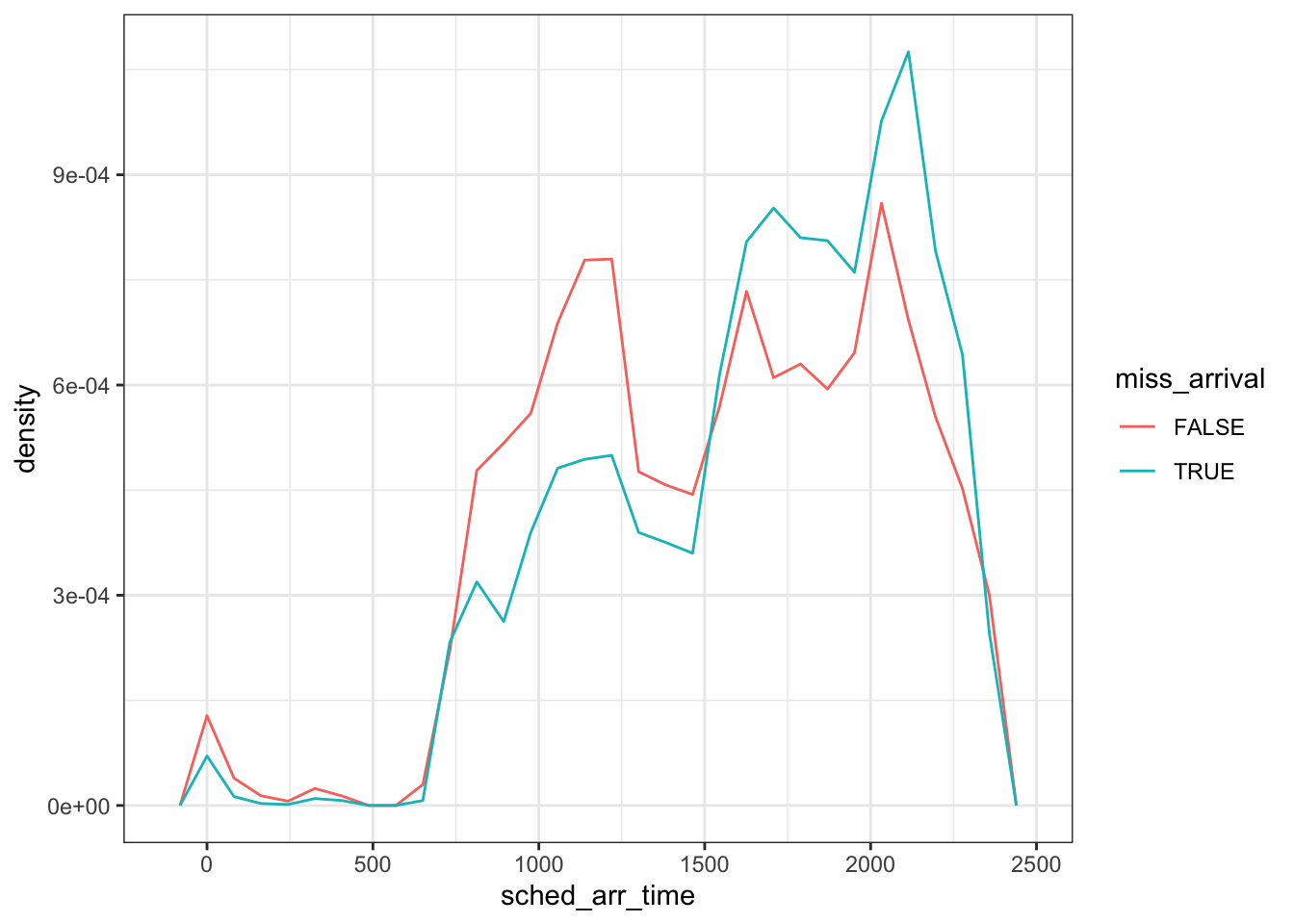
The two curves are now standardized so that the area under each curve equals 1, which in turn makes comparison between the two groups easier.
One other special note, for EDA internally, there is no need to spend much time worrying about formatting of the graphics. However, if this plot above would be included in a report or manuscript, this figure would need additional polish to be included.
Variation
Another common EDA question is related to variation. Variation is important for statistics, without variation there is no need to do statistics. The best way to explore variation of any type of variable is through visulization. This section will be broken into two sub areas, one that explores qualitative and another that explores quantitative.
Qualitative Variables
Bar graphs (frequency tables) are commonly used to explore variation in qualitative variables. For example, if we wished to explore the number of flights that took off for each month of the year from NYC:
ggplot(flights, aes(factor(month))) +
  geom_bar() +
  theme_bw()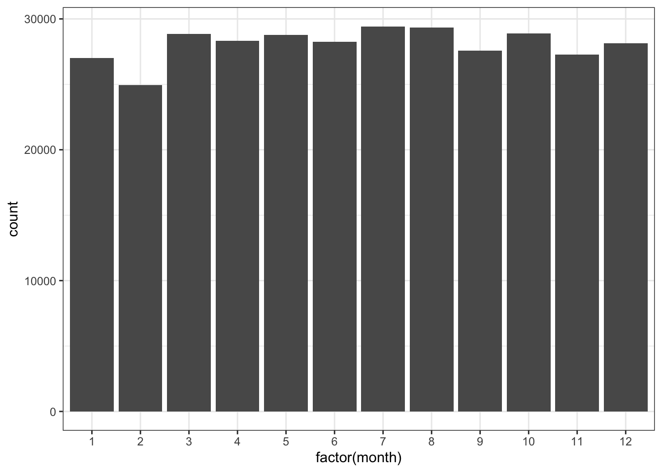
One special note about the above code, I used the factor() function so that ggplot specifically added all the values of the variable to the x-axis. By default since the month variable is being treated as an integer (a number), it would not show all the values for month.
These counts could be calculated manually with the use of dplyr using the count function. The count function basically creates a frequency table. More complex tables can be created by passing additional variables to the count function.
flights %>%
  count(month)
## # A tibble: 12 × 2
## month n
## <int> <int>
## 1 1 27004
## 2 2 24951
## 3 3 28834
## 4 4 28330
## 5 5 28796
## 6 6 28243
## 7 7 29425
## 8 8 29327
## 9 9 27574
## 10 10 28889
## 11 11 27268
## 12 12 28135Exercises
- Copy the code from the bar graph above, but instead of wrapping the month variable in factor, try it without it. What is different? Extra, using the
scale_x_continuousfunction, can you manually add each of the 12 numeric month values to the plot? - Using dplyr, manually calculate the number of flights that took off for every day of every month. In other words, how many flights took off everyday of the year. Which day had the most flights?
Quantitative Variables
Histrograms, frequency polygons, or density curves are three common options to explore variation with quantitative variables. Within the flights data, suppose we were interested in exploring the variation in the distance traveled, this could easily be done with a histrogram.
ggplot(flights, aes(distance)) +
  geom_histogram() +
  theme_bw()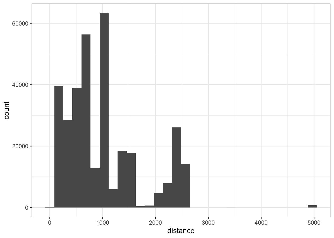
We could also use a frequency polygon:
ggplot(flights, aes(distance)) +
  geom_freqpoly() +
  theme_bw()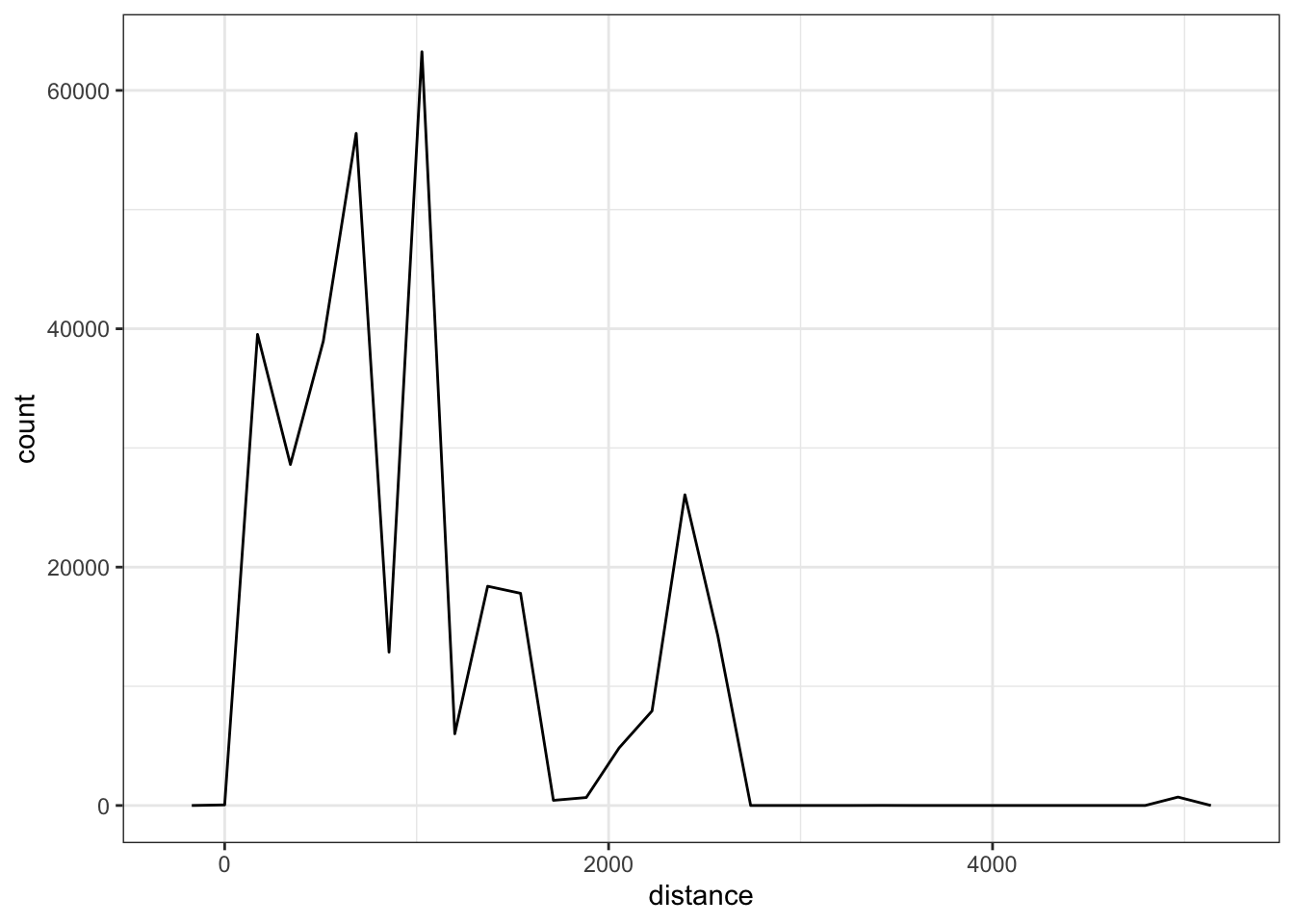
We could also use a density curve:
ggplot(flights, aes(distance)) +
  geom_density() +
  theme_bw()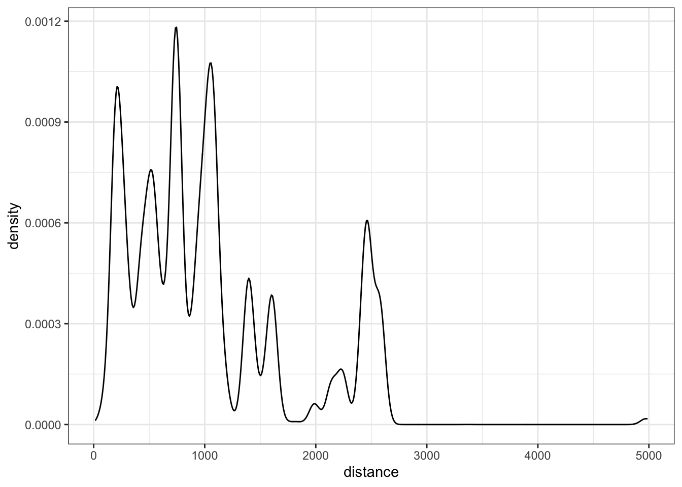
When exploring the variation for a single variable overall, I tend to use histograms. However, when attempting to see if the variation changes across values of a categorical variable, histograms are difficult as the groups likely overlap. These are instances when using the frequency polygon or density curves are useful. Here are examples of both when exploring variation differences by month.
ggplot(flights, aes(distance)) +
  geom_freqpoly(aes(color = factor(month))) +
  theme_bw()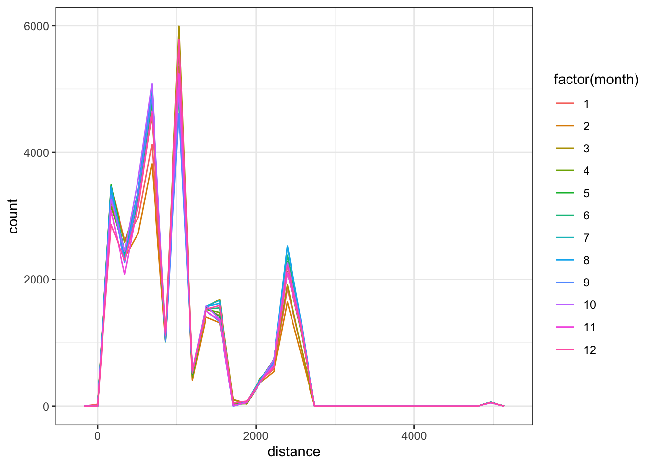
ggplot(flights, aes(distance)) +
  geom_density(aes(color = factor(month))) +
  theme_bw()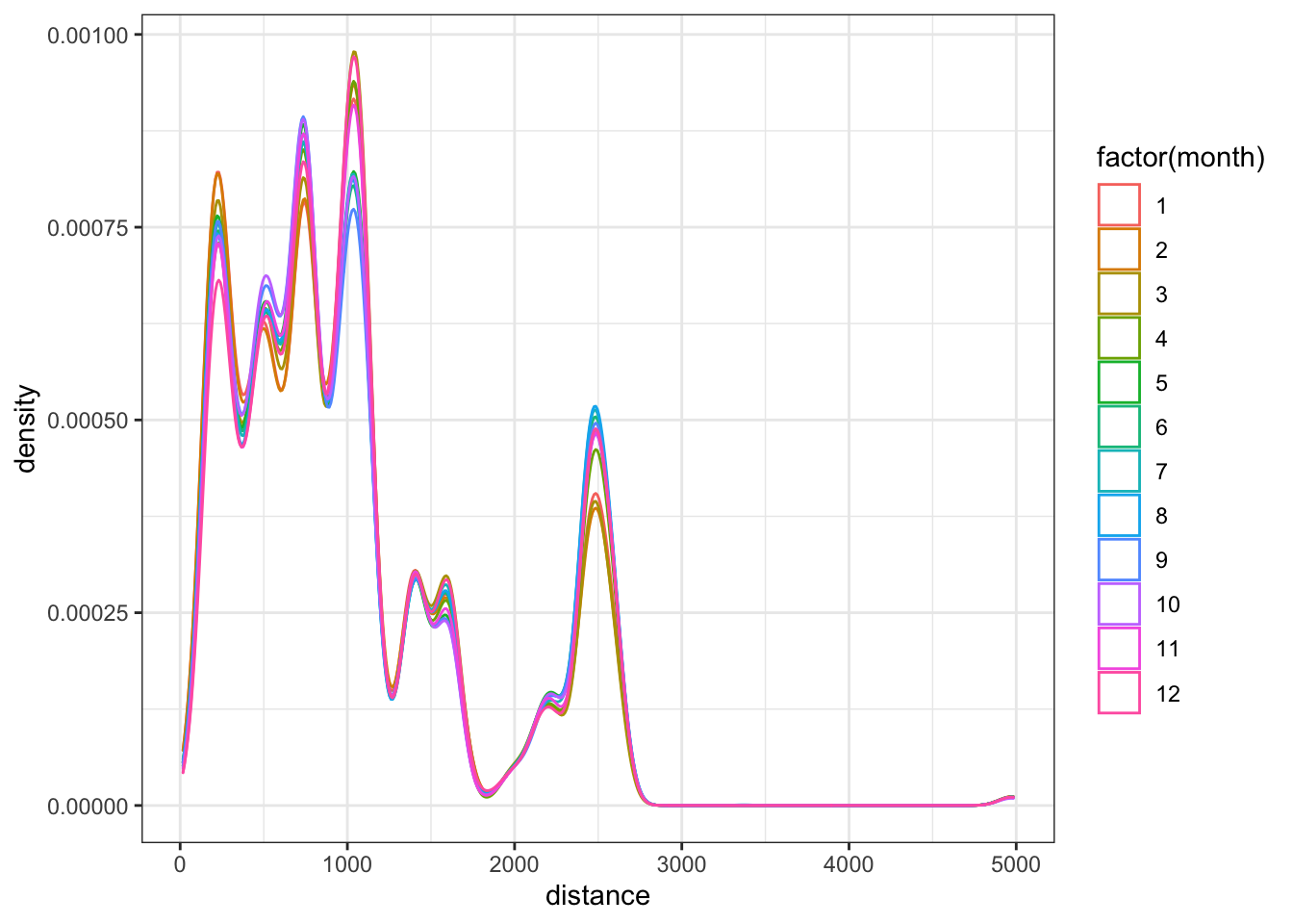
You can also calculate the counts plotted in the histograms and frequency polygons using the count as with qualitative variables. We just now need to use the cut_width function to specify bins.
flights %>%
  count(cut_width(distance, 100))
## # A tibble: 28 × 2
## `cut_width(distance, 100)` n
## <fct> <int>
## 1 [-50,50] 1
## 2 (50,150] 2514
## 3 (150,250] 36839
## 4 (250,350] 18442
## 5 (350,450] 15233
## 6 (450,550] 29149
## 7 (550,650] 11688
## 8 (650,750] 33482
## 9 (750,850] 19482
## 10 (850,950] 19644
## # … with 18 more rowsNote, these counts may differ from above as the binwidth was not specifically stated when creating the histrogram or frequency polygon.
It may also be useful to calculate the variance, standard deviation, or the range. These can be calculated using the summarize function.
flights %>%
  summarize(
    var_dist = var(distance, na.rm = TRUE),
    sd_dist = sd(distance, na.rm = TRUE),
    min_dist = min(distance, na.rm = TRUE),
    max_dist = max(distance, na.rm = TRUE)
  )
## # A tibble: 1 × 4
## var_dist sd_dist min_dist max_dist
## <dbl> <dbl> <dbl> <dbl>
## 1 537631. 733. 17 4983You could pair this with the group_by function to calculate these values for different groups (e.g. by month).
Exercises
- Explore variation in the air_time variable.
- Does the variation in the air_time variable differ by month?
Distributions
Exploring distributions for variables is a very similar process to exploring the variation, the question is just different. Most often we are interested in exploring if the shape of the distribution is approximately normal. This will become more interesting when we start fitting models to explore potential assumption violations in the residuals. We leave these discussions until then.
Covariation
Covariation is the process of comparing how two (or more) variables are related. The most common method for exploring covariation is through scatterplots. However, these are most natural for two continuous variables. Other plots are useful for a mixture of variable types or for two qualitative variables. We will explore each in turn.
Two Qualitative Variables
Covariation in two qualitative variables is more difficult to view visually due to the restricted possible values in each variable. Suppose for example, we wished to explore covariation in the origin of the flight and the carrier.
ggplot(flights, aes(origin, carrier)) +
  geom_count()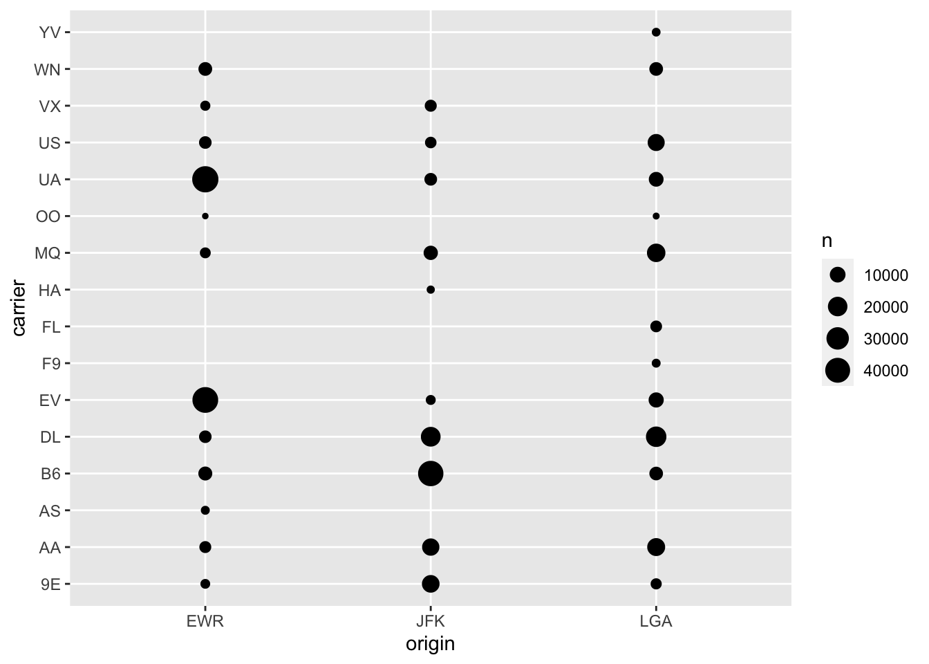
This plot is okay, however, I think a more useful plot is to use a tile plot to explore these differences with color.
flights %>%
  count(origin, carrier) %>%
  ggplot(aes(origin, carrier)) +
  geom_tile(aes(fill = n)) +
  theme_bw()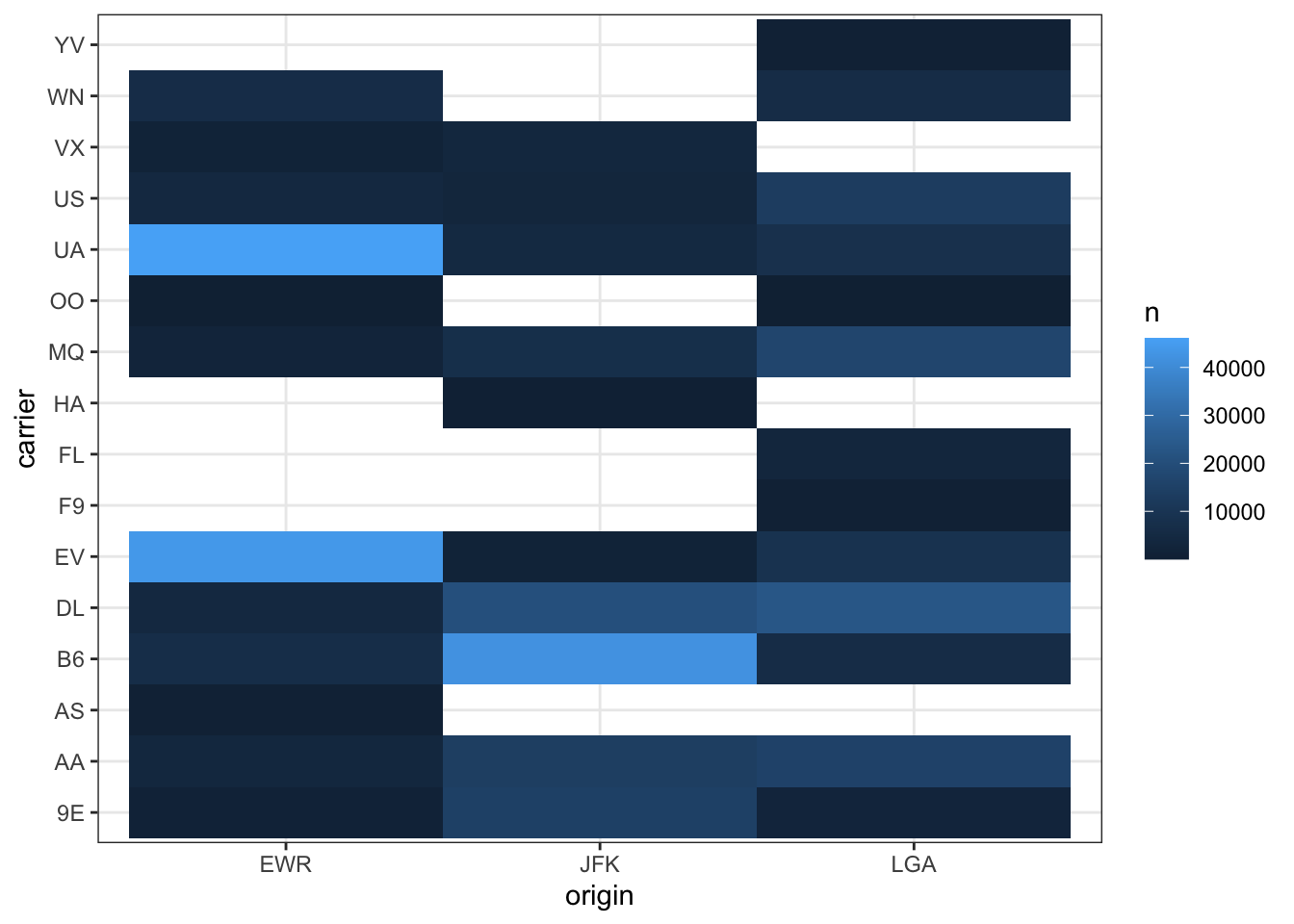
Note, that holes mean missing values (i.e. no flights from that airport from that carrier).
Exercises
- Explore the covariation between the month and day variables. Note, these are treated as continuous in the data, but in reality they are likely best represented as qualitative.
Two Quantitative Variables
Scatterplots are useful for two quantitative variables. Suppose for example that we wish to explore the relationship between the air_time variable and the arr_delay variable. This could be done with a scatterplot.
ggplot(flights, aes(air_time, arr_delay)) +
  geom_point() +
  theme_bw()
## Warning: Removed 9430 rows containing missing values (geom_point).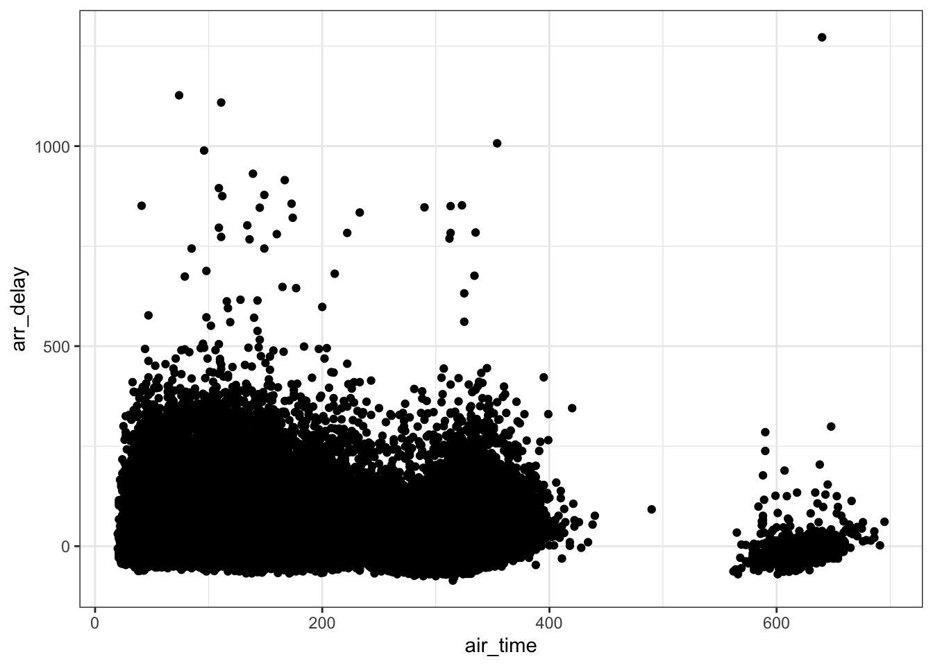
One problem with the plot above, is overplotting. There are two fixes for this, one is to use transparent points using the alpha argument to the geom_point function.
ggplot(flights, aes(air_time, arr_delay)) +
  geom_point(alpha = .05) +
  theme_bw()
## Warning: Removed 9430 rows containing missing values (geom_point).![]()
Another approach that will simplify the exploration is to use boxplots. This will involve grouping the air_time variable into “bins.”
ggplot(flights, aes(x = air_time, y = arr_delay)) +
  geom_boxplot(aes(group = cut_width(air_time, 50))) +
  theme_bw()
## Warning: Removed 9430 rows containing missing values (stat_boxplot).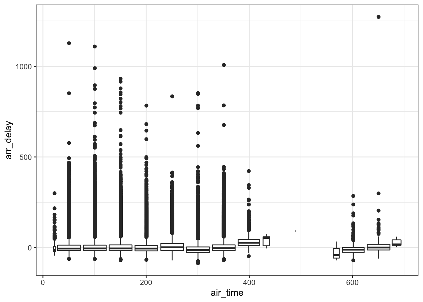
Even another more sophisticated graphic is to do the quantitative alternative to geom_tile. Note, the code below uses the hexbin package, but a similar function is geom_bin2d.
# install.packages("hexbin")
library(hexbin)
ggplot(flights, aes(x = air_time, y = arr_delay)) +
  geom_hex()
## Warning: Removed 9430 rows containing non-finite values (stat_binhex).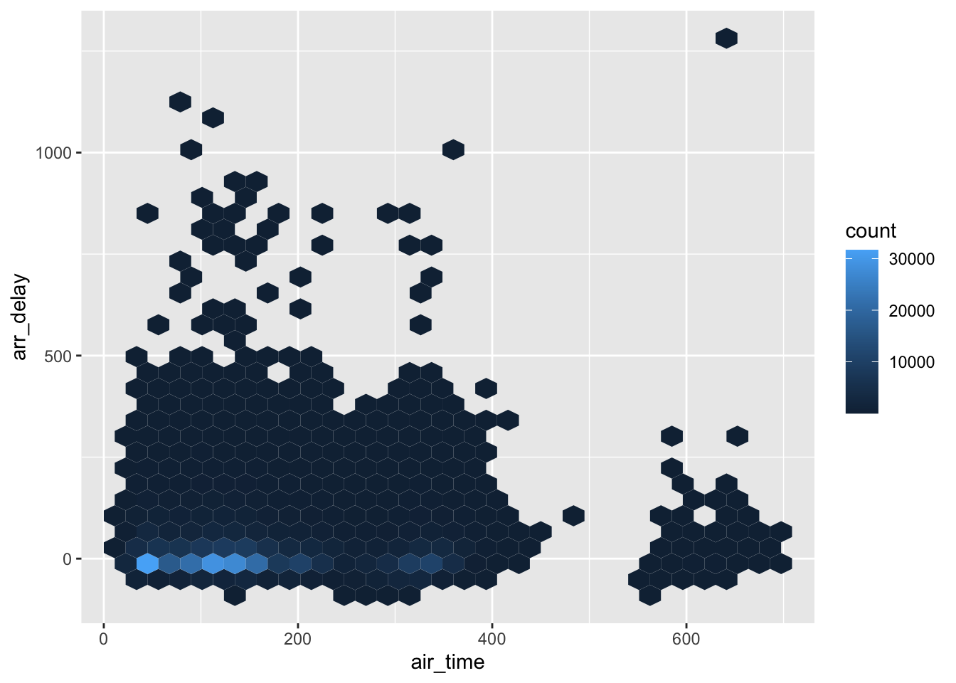
Adding a Third Variable
Adding a third variable is often useful, but can be difficult to think about procedurally. The type of plot that is useful depends on the type the third variable is. For example, if the third variable is also quantitative, the visualization is more difficult, however, if the third variable is qualitative, there are two main options. These will be explored in more detail below.
The main two approaches for adding a third variable when it is qualitative is to use a different color/shape for the values of this variable or to facet the plot. Suppose we wished to explore the covariation between the following three variables: air_time, arr_delay, and origin. The two different options are shown below.
ggplot(flights, aes(air_time, arr_delay)) +
  geom_hex() +
  facet_grid(. ~ origin) +
  theme_bw()
## Warning: Removed 9430 rows containing non-finite values (stat_binhex).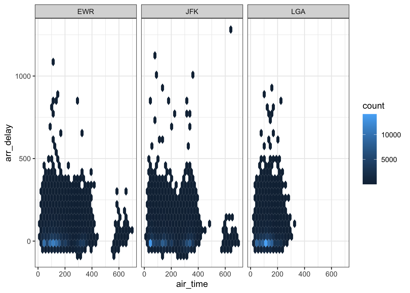
ggplot(flights, aes(air_time, arr_delay)) +
  geom_point(aes(color = origin), alpha = .05) +
  theme_bw()
## Warning: Removed 9430 rows containing missing values (geom_point).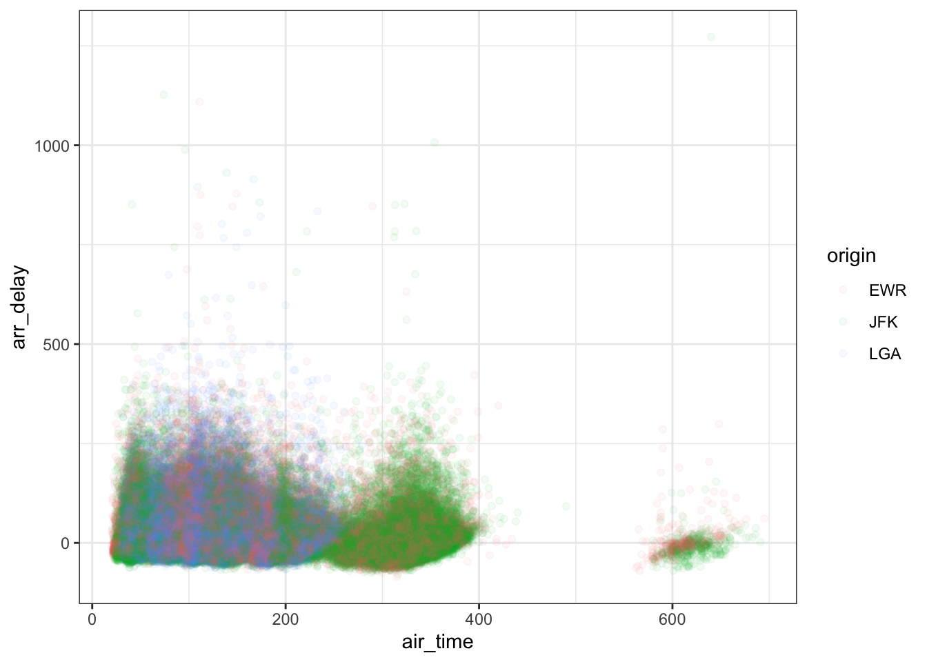
Plotting three quantitative variables commonly involves binning one one the variables to turn it into an ordinal variable with different levels. For example, see the example with two variables and the boxplot, a similar approach could be used to facet by this third variable. Below is a simple example:
ggplot(flights, aes(x = air_time, y = arr_delay)) +
  geom_hex() +
  theme_bw() +
  facet_wrap(~ cut_width(dep_time, 250))
## Warning: Removed 9430 rows containing non-finite values (stat_binhex).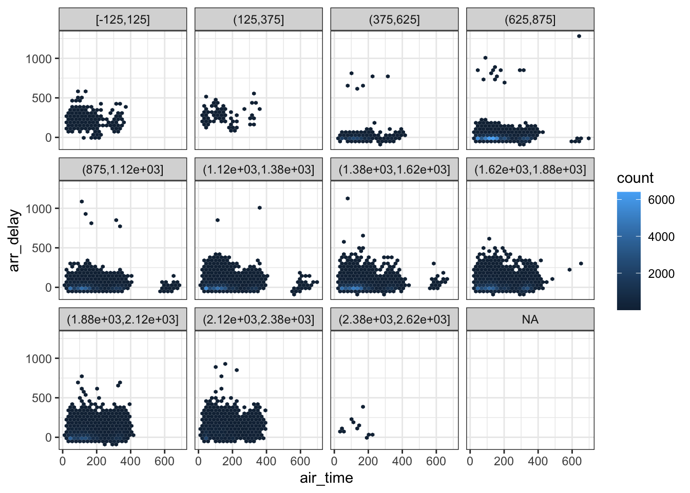
One Quantitative, One Qualitative
This was actually already discussed in the discussion of variation by exploring differences in variation for different levels of a qualitative variable (see above). If the variation differs by groups, there is then evidence of covariation.
Correlations
It is also useful to calculate and visualize raw correlations. To calculate raw correlations (assuming only quantitative variables), the cor function is useful.
flights %>%
  select(air_time, arr_delay, dep_time) %>%
  cor(use = 'pairwise.complete.obs')
## air_time arr_delay dep_time
## air_time 1.00000000 -0.03529709 -0.01461948
## arr_delay -0.03529709 1.00000000 0.23230573
## dep_time -0.01461948 0.23230573 1.00000000To visualize a correlation matrix, the GGally package is useful. Note, the ggpairs function can take some time to run.
# install.package("GGally")
library(GGally)
flights %>%
  select(air_time, arr_delay, dep_time) %>%
  na.omit() %>%
  sample_n(1000) %>%
  ggpairs()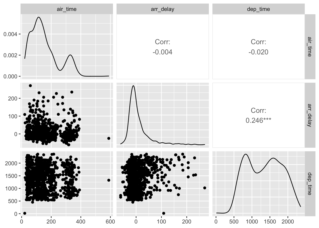
Exercises
- Explore covariation in the dep_delay and arr_delay variables. What type of relationship, if any, appears to be present?
- Explore the relationship between dep_delay, arr_delay, and origin. What type of relationship is present. Does the relationship between dep_delay and arr_delay differ by origin?
- Finally, calculate the correlation matrix for dep_delay, arr_delay, and dep_time.
Rare/Common Cases
The last question of use to explore when performing EDA is looking for the presence of rare or common cases. In other words, an exploration of any outliers and the central tendency of the distribution.
When we explored variation in the distance variable earlier, there may have been extreme values we’d want to explore in more detail.
ggplot(flights, aes(distance)) +
  geom_histogram() +
  theme_bw()
Notice the large distance value, to get a better view of how many there are here, we can use coord_cartesian to zoom in.
ggplot(flights, aes(distance)) +
  geom_histogram() +
  theme_bw() +
  coord_cartesian(ylim = c(0, 5000))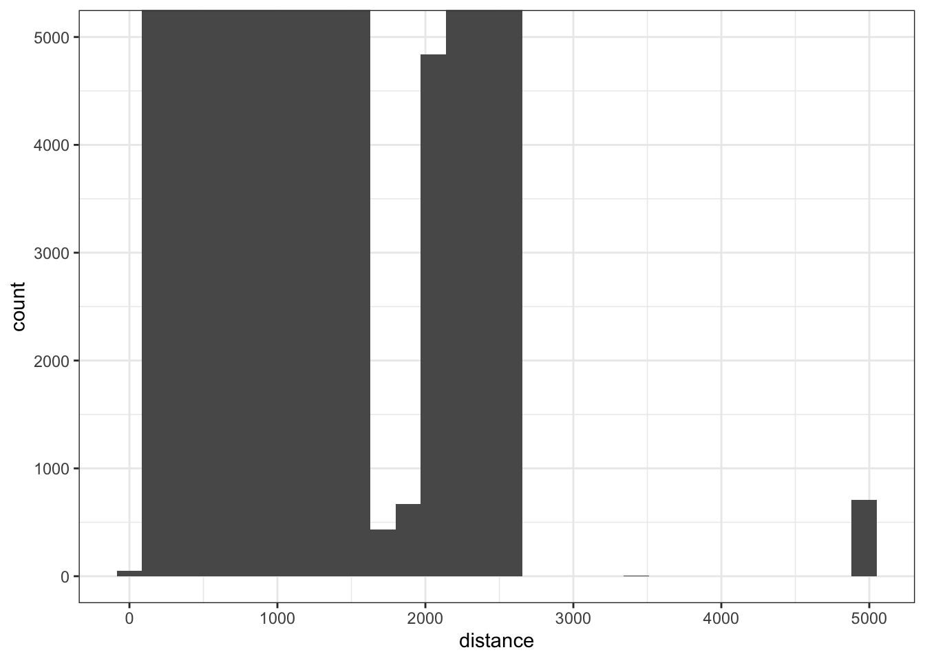
Note, that in the above plot, coord_cartesian does not remove any points, simply changes the coordinates that are plotted. We could also pull these out using filter as well.
flights %>%
  filter(distance > 3000) %>%
  arrange(distance)
## # A tibble: 715 × 19
## year month day dep_time sched_dep_time dep_delay arr_time sched_arr_time
## <int> <int> <int> <int> <int> <dbl> <int> <int>
## 1 2013 7 6 1629 1615 14 1954 1953
## 2 2013 7 13 1618 1615 3 1955 1953
## 3 2013 7 20 1618 1615 3 2003 1953
## 4 2013 7 27 1617 1615 2 1906 1953
## 5 2013 8 3 1615 1615 0 2003 1953
## 6 2013 8 10 1613 1615 -2 1922 1953
## 7 2013 8 17 1740 1625 75 2042 2003
## 8 2013 8 24 1633 1625 8 1959 2003
## 9 2013 1 1 1344 1344 0 2005 1944
## 10 2013 1 2 1344 1344 0 1940 1944
## # … with 705 more rows, and 11 more variables: arr_delay <dbl>, carrier <chr>,
## # flight <int>, tailnum <chr>, origin <chr>, dest <chr>, air_time <dbl>,
## # distance <dbl>, hour <dbl>, minute <dbl>, time_hour <dttm>Measures of Central Tendency
Exploring measures of central tendency or simply common values/repeated of common values can also be important.
ggplot(flights, aes(arr_time)) +
  geom_histogram(binwidth = 50) +
  theme_bw()
## Warning: Removed 8713 rows containing non-finite values (stat_bin).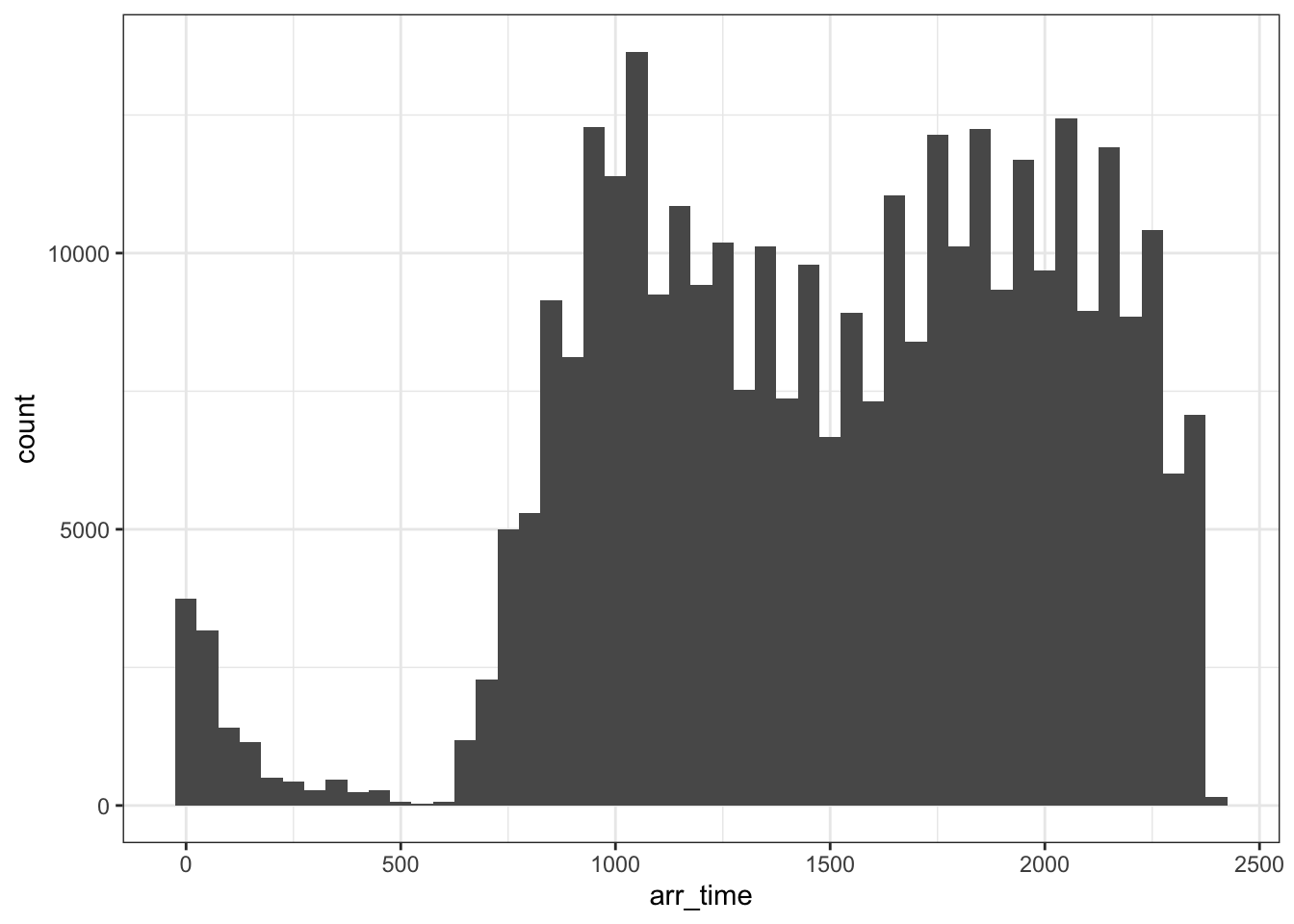
Measures of central tendency can be directly calculated using the summarise function. For example, exploring central tendency of the arr_delay variable.
flights %>%
  summarise(
    avg_arrdelay = mean(arr_delay, na.rm = TRUE),
    med_arrdelay = median(arr_delay, na.rm = TRUE)
  )
## # A tibble: 1 × 2
## avg_arrdelay med_arrdelay
## <dbl> <dbl>
## 1 6.90 -5More interesting computations can be performed by using adding in the group_by function.
Exercises
- Using the
txhousingdata, explore rare/common cases in the median sale price for the following 3 cities: Austin, Dallas, and Houston. - Using the data from #1, explore measures of central tendency in the median sale price of these three cities. How have these changed over time (year)?
- Create an effective visualization that explores differences in the median sale price over time for these three cities.