Interactive Graphics
Interactive graphics can be a great way to enhance the presentation of study results, particularly if the output format is HTML. These can be great for presentations, HTML reports, or online applications like dashboards or shiny apps.
In general, interactive graphics make use of Javascript libraries to perform the interactive visualization. One of the more well known Javascript libraries for interactive web based graphics is d3, https://d3js.org/. If you take a look at the example page from the previous url, you can see that there are a lot of options for a large variety of graphics. d3 visualizations are highly flexible and powerful, however they also require fairly strong Javascript skills to fully implement the graphics.
In this course, we will create interactive graphics using plotly, https://plot.ly/, was built using Python, but uses Javascript and d3 libraries for their graphics. What is nice about plotly, is that you can create interactive graphics from statis ggplot2 graphics. This is where we will start, but the materials will also walk through the creation of plotly graphics in R by scratch. The primary benefit of creating the plotly graphics by scratch is likely performance based when hosting on the web. If you are creating a single interactive version, first creating a ggplot2 figure and turning it interactive would likely be the most straightforward.
Interactive graphics with plotly
install.packages("plotly")Static to Interactive
The first example we will show is how to turn a static figure created with ggplot2 into an interactive version with plotly. The ggplotly() function from the plotly package is the ticket to doing this. Below is an example of creating a static scatterplot with ggplot2. Notice that I save this figure into the object named, p. This is then passed to the ggplotly() function to generate the equivalent plotly interactive figure. I did not explicitly print the static image, but I encourage you to print out the static image, named p here, to verify that it is indeed the same figure.
library(tidyverse)
library(plotly)
p <- ggplot(data = midwest) +
  geom_point(mapping = aes(x = popdensity, y = percollege))
ggplotly(p)
The interactive version allows you to hover over the points to see the specific values. In addition, there are specific ways to interact with the figure that show up just above the figure itself. These options include, zoom, pan around the image, toggle spike lines, save a png static image, compare points on hover, etc. There are also options to select data points, these are most useful when you link plots together in web-based applications so that a single image can be used to select the points that will show up in subsequent figures. This will be explored in more detail later.
Customized Interactive Plot
This is an example of a customized interactive plot to show that the ggplotly() function does a great job of translating a figure that has been customized by adding a color aesthetic, custom axis labels and breaks, and applying a new theme. ggplotly() can handle all of these manipulations which makes it highly flexible.
p <- ggplot(midwest,
       aes(x = popdensity, y = percollege, color = state)) +
  geom_point() +
  scale_x_continuous("Population Density",
                     breaks = seq(0, 80000, 20000)) +
  scale_y_continuous("Percent College Graduates") +
  scale_color_discrete("State") +
  theme_bw()
ggplotly(p)
Your Turn
- Using the
starwarsdata, create a static ggplot and use theggplotlyfunction to turn it interactive.
Creating plotly figures manually
Using the ggplotly() function is a great way to create interactive graphics using what you already know about creating static figures with ggplot2. However, there may be instances where the ggplotly() function does not work or that there are additional features that you want to take advantage of. In these cases, knowing a bit about creating interactive graphics from the ground up using plotly is helpful.
We will read in some data about the lord of the rings that comes from Jenny Bryan: https://github.com/jennybc/lotr. These data can be read directly from GitHub with the following command. As you can see from the data, the data contains a row for each film, chapter, and character from the lord of the rings about the number of words that character spoke in each chapter of each of the three films.
lotr <- read_tsv('https://raw.githubusercontent.com/jennybc/lotr/master/lotr_clean.tsv')## Rows: 682 Columns: 5
## ── Column specification ────────────────────────────────────────────────────────
## Delimiter: "\t"
## chr (4): Film, Chapter, Character, Race
## dbl (1): Words
##
## ℹ Use `spec()` to retrieve the full column specification for this data.
## ℹ Specify the column types or set `show_col_types = FALSE` to quiet this message.lotr## # A tibble: 682 × 5
## Film Chapter Character Race Words
## <chr> <chr> <chr> <chr> <dbl>
## 1 The Fellowship Of The Ring 01: Prologue Bilbo Hobbit 4
## 2 The Fellowship Of The Ring 01: Prologue Elrond Elf 5
## 3 The Fellowship Of The Ring 01: Prologue Galadriel Elf 460
## 4 The Fellowship Of The Ring 02: Concerning Hobbits Bilbo Hobbit 214
## 5 The Fellowship Of The Ring 03: The Shire Bilbo Hobbit 70
## 6 The Fellowship Of The Ring 03: The Shire Frodo Hobbit 128
## 7 The Fellowship Of The Ring 03: The Shire Gandalf Wizard 197
## 8 The Fellowship Of The Ring 03: The Shire Hobbit Kids Hobbit 10
## 9 The Fellowship Of The Ring 03: The Shire Hobbits Hobbit 12
## 10 The Fellowship Of The Ring 04: Very Old Friends Bilbo Hobbit 339
## # … with 672 more rowsLet’s now build a histogram from the ground up using plotly. The primary function to define the figure attributes is plot_ly(). This function behaves similarly to the ggplot() function from the ggplot2 package. The primary arguments are the data to be used for plotting and the aesthetic attributes. As we are creating a histrogram, only the x aesthetic needs to be defined. One difference between plotly and ggplot2 is that the aesthetics passed to the plot_ly() function need to have a ~ before the variable name. Notice here that the x aesthetic is defined as ~Words meaning that we want the Words variable to be placed on the x-axis. After specifying the data and aesthetics, we need to tell plotly what type of figure we’d like. In this example, the add_histogram() function is used with no arguments to create a histrogram.
plot_ly(lotr, x = ~Words) %>%
  add_histogram()
You’ll notice you get the same elements as the figures created with ggplotly() like zoom, pan, data specifics on hover, etc.
Grouped bar plot
Building off the histogram example above, let’s create a bar chart. In the plotly syntax, the add_histogram() function is used for true histograms and for bar charts. Very confusing! The primary difference is that bar charts are created when a categorical variable is placed on the x-axis. In the example below, the character race is placed on the x-axis. In addition, the Film is specified with different colors, this allows the creation of bars for each unique Film and by default are placed as dodged bar charts.
plot_ly(lotr, x = ~Race, color = ~Film) %>%
  add_histogram()
Bar plot of proportions
As we discussed when talking about static visualizations, dodged bar charts can be difficult to explore differences across the films due to differences in how popular each race is across the movies. In this case, normalizing the bar chart and stacking them based on the proportion each movie contains out of the total for each race. plotly does not do this by default, instead computations of these proportions need to be done first, then this summarized data can be plotted. Below is an example of doing this. First, the counts are calculated by race and film, then this is joined using another count just of race. This second count is how the standardization will be done. I encourage you to explore the lotr_prop data to understand what the data looks like.
These data are then passed to the plot_ly function after calculating the individual proportion of each race and film. To plot these bars, the add_bars() function is used to create the bars and finally, using the layout() function, the argument barmode = "stack" is used to create the final figure show. I encourage you to explore intermediate steps to understand what the output looks like in each step along the way.
## number of diamonds by cut and clarity (n)
lotr_count <- count(lotr, Race, Film)
## number of diamonds by cut (nn)
lotr_prop <- left_join(lotr_count, count(lotr_count, Race, wt = n),
                       by = 'Race')

lotr_prop %>%
  mutate(prop = n.x / n.y) %>%
  plot_ly(x = ~Race, y = ~prop, color = ~Film, width = 900) %>%
  add_bars() %>%
  layout(barmode = "stack")
Your Turn
- Using the
gss_catdata, create a histrogram for thetvhoursvariable. - Using the
gss_catdata, create a bar chart showing thepartyidvariable by themaritalstatus.
Scatterplots by Hand
Scatterplots are similar to the bar charts, the main difference is that variables are passed to both the x and y axes and the add_markers() function is used to create the scatterplot. Markers are plotly’s equivalent to points from ggplot2.
plot_ly(midwest, x = ~popdensity, y = ~percollege) %>%
  add_markers()
Change symbols
Changing symbols (i.e. shape of points in ggplot2 language) can be done by passing a character variable to the symbol argument/aesthetic within the add_markers() function. The symbol argument/aesthetic should also be able to be specified in the plot_ly() function globally instead of in the add_markers() function.
plot_ly(midwest, x = ~popdensity, y = ~percollege) %>%
  add_markers(symbol = ~state)
Change colors
Changing of colors can be done similarly to the markers/points shown above. In particular, the color argument/aesthetic can be specified with a variable name. The default color values for a discrete/categorical variable is Set2 from the RColorBrewer package; http://colorbrewer2.org/#type=qualitative&scheme=Set2&n=3.
plot_ly(midwest, x = ~popdensity, y = ~percollege) %>%
  add_markers(color = ~state, color = ~state)
Line Graph
Line graphs have the same specification as the scatterplots in that the x and y axes have to be specified and the add_lines() function is used. In the example below, I first summarise the number of tropical storms that occurred each year from 1975 to 2015, then plot these values with a line plot. Not shown in the examples, but if there are multiple trajectories that you wish to plot, you can distinguish these with color or linetype aesthetics similar to the changing of markers or colors shown with scatterplots.
storms_yearly <- storms %>%
  group_by(year) %>%
  summarise(num = length(unique(name)))

plot_ly(storms_yearly, x = ~year, y = ~num) %>%
  add_lines()
Your Turn
- Using the
gss_catdata, create a scatterplot showing theageandtvhoursvariables. - Compute the average time spent watching tv by year and marital status. Then, plot the average time spent watching tv by year and marital status.
Subplots
There are a few different ways to create subplots or facetted plots using ggplot2 terminology. In all of these elements, the subplot() function from plotly will be used. Three ways will be shown to create subplots, one that manually creates each unique plotly figure and combine with subplot(), a second will create a function that can be passed to a list, and the final will use facetting within ggplot2 and pass to the subplot() function.
Manually create multiple plotly figures
The first way to create multiple figures side by side is to manually create multiple plotly figures, save these as objects, then use the subplot() function to combine them into a single figure. Below, I’m going to use the tropical storm data from the line plot example, and instead of calculating the number of storms each year, I’m going to calculate the maximum wind speed and minimum pressure for each year and plot these values.
One thing to note about this figure, the two axes are different which may not be best practice in combining figures as this can complicate interpretation. I also specified the name argument to the add_lines() function for each figure created. This allowed for the creation of the legend that differentiates the two different figures.
storm_summary <- storms %>%
  group_by(year) %>%
  summarise(max_wind = max(wind),
         min_pressure = min(pressure))

p1 <- plot_ly(storm_summary, x = ~year, y = ~max_wind) %>%
  add_lines(name = 'Max Wind')
p2 <- plot_ly(storm_summary, x = ~year, y = ~min_pressure) %>%
  add_lines(name = 'Min Pressure')
subplot(p1, p2)
Function to data list
Another way to create subplots, is to create a function that creates a single plot for a specific panel. Then, this function is passed to the data after the data has been split into a list of data corresponding to the data for each film using the group_split() function from dplyr. Finally, the lapply() function is used to iterate over this list and apply the one_plot function to each element of the list. This functionally creates a histogram of the words for each of the three movies. These are then combined together using the subplot() function, forced to span one row and the legend is omitted since I added the text label at the top of each function with the add_annotations() function. The add_annotations() function takes a text argument, in this case the specific film, and position arguments. I’ve found the specification of the position arguments is best done through trial and error.
one_plot <- function(d) {
  plot_ly(d, x = ~Words) %>%
    add_histogram() %>%
    add_annotations(
      ~unique(Film), x = 0.5, y = 1,
      xref = "paper", yref = "paper", showarrow = FALSE
    )
}

lotr %>%
  group_split(Film) %>%
  lapply(one_plot) %>%
  subplot(nrows = 1, shareX = TRUE, titleX = FALSE) %>%
  hide_legend()
Facetting with ggplot2
You can also create general facetting with ggplot2 and use the ggplotly() function to preserve those facets. For example, we can recreate a similar plot with the histograms for each movie as above with the following code. One nice feature of the subplots, is that if you zoom in on one facet, the view is automatically updated on subsequent facets.
lotr_hist <- ggplot(lotr, aes(x = Words, fill = Film)) +
  geom_histogram(bins = 20) +
  facet_wrap(~ Film) +
  theme_bw() +
  theme(legend.position = 'none')

ggplotly(lotr_hist)
Leaflet Example
I want to go through a few alternative ways to visualize data in an interactive framework. One of these is using the leaflet package which allows one to create interactive visualizations of map data. Using the storms data about tropical storms, I first filter that data to only include two well known tropical storms that occured over the past 20 years, Katrina and Ike. The leaflet() function is used to initialize the map, the add_tiles() adds the map overlay using OpenStreetMap by default. Then the add_circles() function is used to add circles for each latitude/longitude location of the tropical storms in the data. The circles are sized based on the wind speed using the radius argument and the name of the tropical storm is added via the popup argument. This will allow one to click on a circle and the name will be shown. You could customize this further by creating a new variable that would represent the name and the wind speed or other information by pasting multiple data sources together.
library(leaflet)

storms %>%
  filter(name %in% c('Ike', 'Katrina'), year > 2000) %>%
  leaflet() %>%
  addTiles() %>%
  addCircles(lng = ~long, lat = ~lat, popup = ~name, weight = 1,
             radius = ~wind*1000)
gganimate
The gganimate package is a way to add animation to static images. The figures can then be converted to gifs to be used within many different presentation modes including pdf, html, or others.
I’m going to use the gapminder data to visualize some of these (you’ll likely need to install the gapminder package if you are following along). When using gganimate, you start first with a static graphic.
library(gapminder)

ggplot(gapminder, aes(gdpPercap, lifeExp, size = pop, colour = country)) +
  geom_point(alpha = 0.7, show.legend = FALSE) +
  scale_colour_manual(values = country_colors) +
  scale_size(range = c(2, 12)) +
  scale_x_log10() +
  facet_wrap(~continent)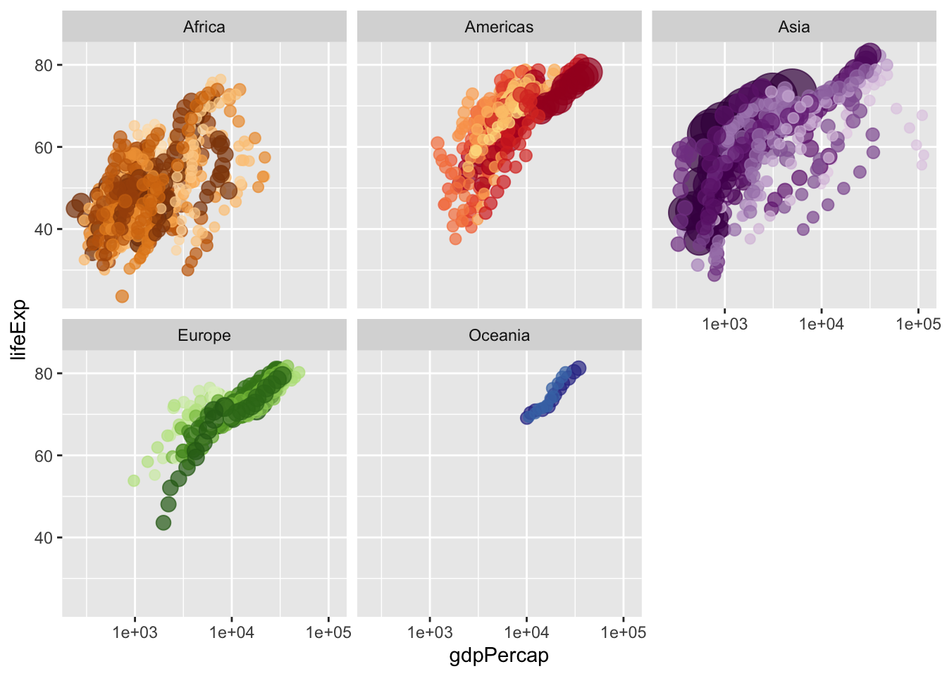
gganimate pieces
First, make sure the gganimate and gifski packages are installed.
install.packages(c("gganimate", "gifski"))We can then show movement over time instead of lumping all the different years into a single figure. This is done with transition_time() function and specifying how we want the transition to move with the ease_aes() function. In addition, a label at the top of the figure is used to show the year in which the data are for, starting with 1952 and moving to 2007 in increments of 5 years (i.e. there is data available every 5 years). Finally, I used the anim_save() function to save the animation with default encodings due to having difficulties getting the image to show up in the R notebook without saving.
library(gganimate)

anim <- ggplot(gapminder, aes(gdpPercap, lifeExp, size = pop, colour = country)) +
  geom_point(alpha = 0.7, show.legend = FALSE) +
  scale_colour_manual(values = country_colors) +
  scale_size(range = c(2, 12)) +
  scale_x_log10() +
  facet_wrap(~continent) +
  # Here comes the gganimate specific bits
  labs(title = 'Year: {frame_time}', x = 'GDP per capita', y = 'life expectancy') +
  transition_time(year) +
  ease_aes('linear')

anim_save(filename = "/Users/brandonlebeau/OneDrive - University of Iowa/Courses/Uiowa/Comp/Syntax/R/v2/gapminder.gif", animation = anim)
Additional Resources
- plotly for R book: https://plotly-book.cpsievert.me/
- plotly: https://plot.ly/
- htmlwidgets: https://www.htmlwidgets.org/
- gganimate: https://gganimate.com/