Graphics Tips
Graphics Basics
- What is the story you want to tell?
- Is the figure misleading?
- Could other figure types be more effective?
- Does the figure show variation?
- Is the figure self-contained?
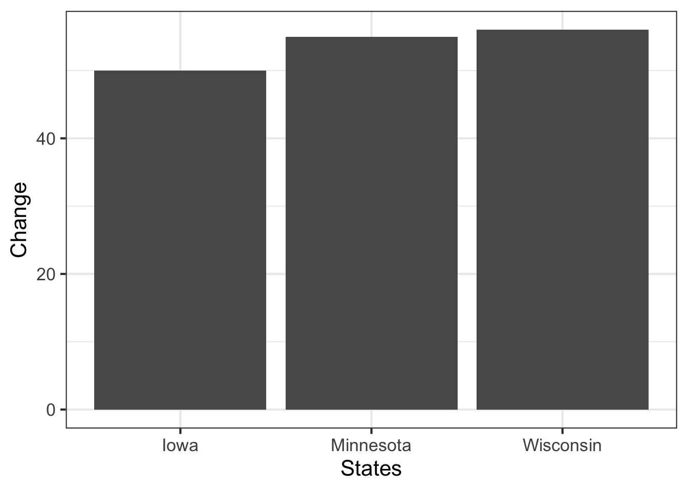
Misleading Graphs
Data visualization is hard and it is easy to mislead, intentionally or unintentionally.
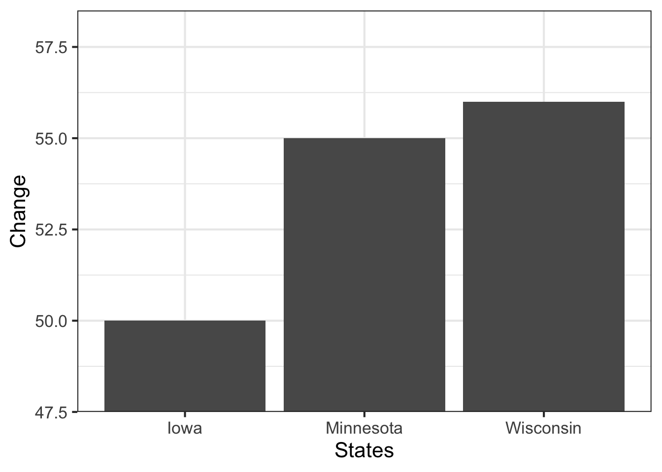
Better Approach
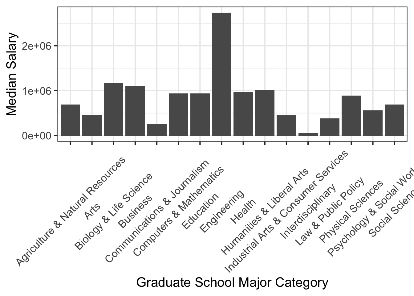
Axis Labels
- Axis labels are often placed on the x-axis, but for long labels this can be less effective.
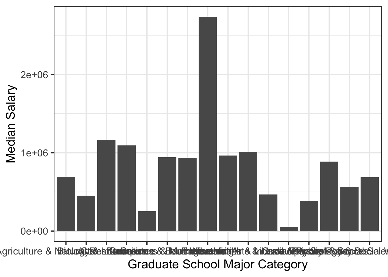
Axis Labels 2
- Often, the labels are rotated. Works, but is ugly and difficult to read in my opinion.
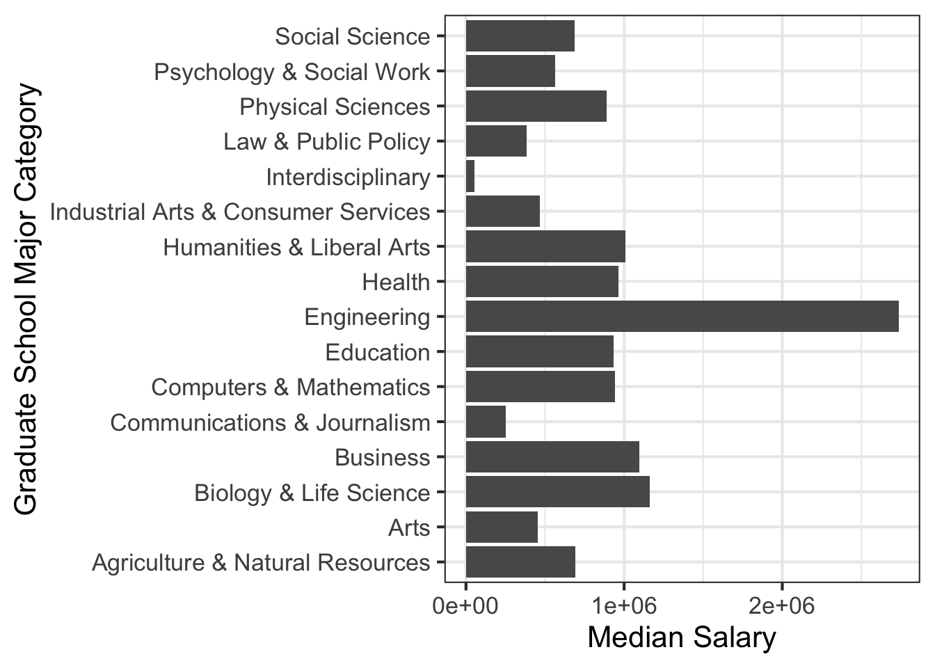
Axis Labels 3
- The solution, flip x and y axis using
coord_flip()!
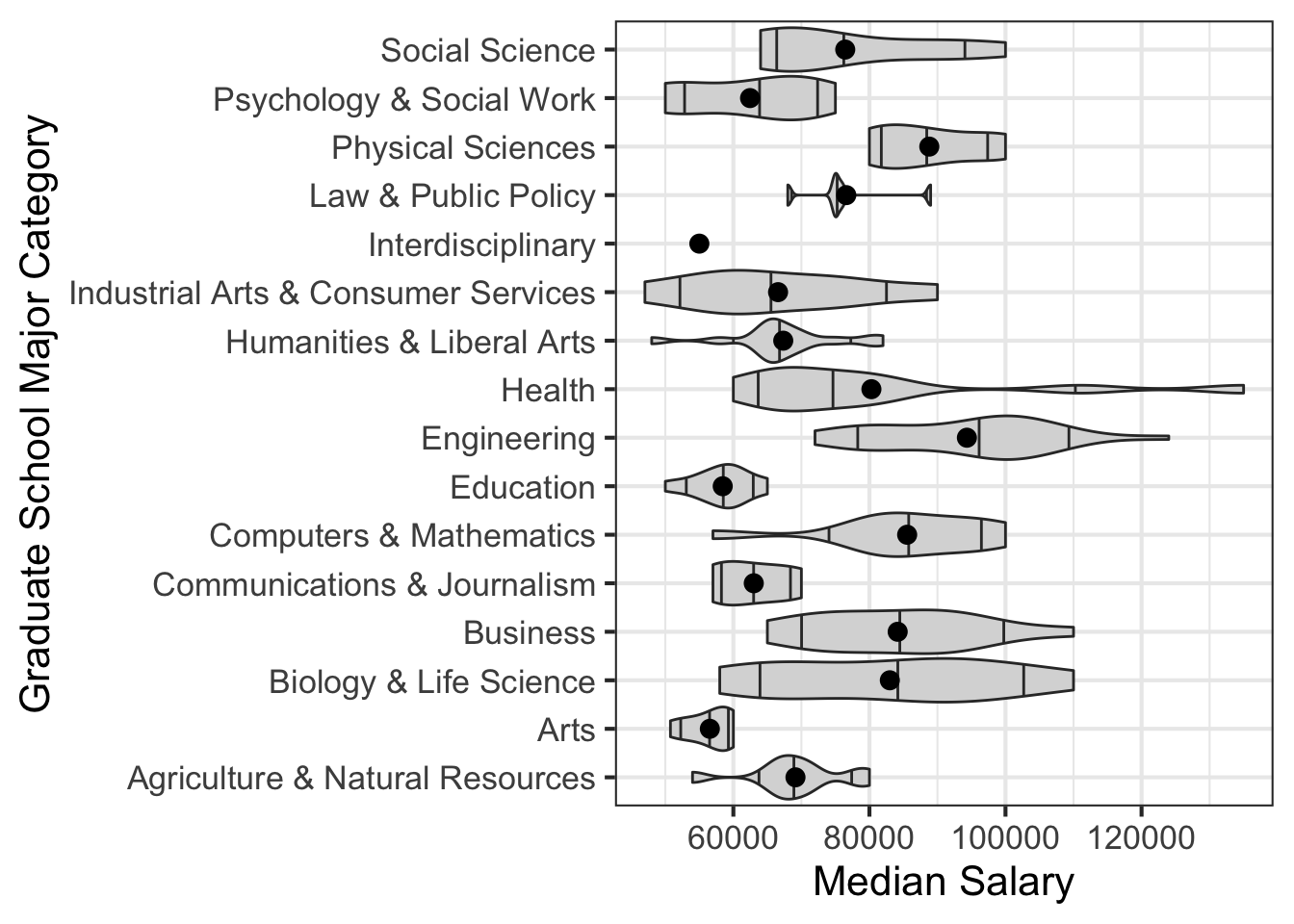
Showing Variation
- Figures depicting statistics, should show variation.
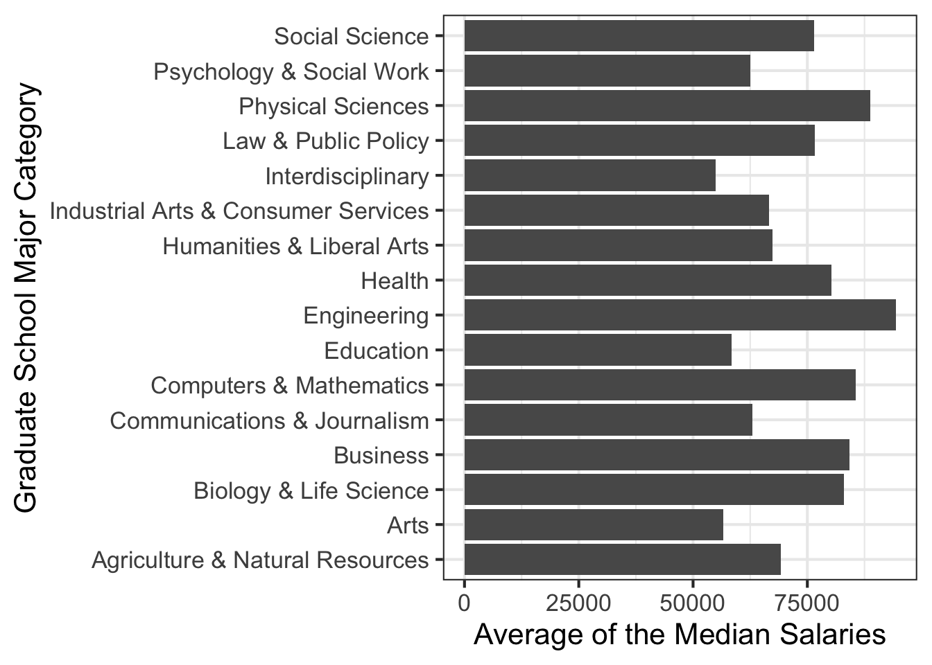
Showing Variation 2
- There are multiple values for each major category, the mean is useful, but simplifies too much and could mislead.